The probability plot is located in the upper right corner of the distribution overview plot.
Use the probability plot to assess how well the distribution that you selected fits your data. If the points follow the fitted line, then it is reasonable to use that distribution to model the data.
The points on the plot are the estimated percentiles based on a nonparametric method. When you hold your pointer over a data point, Minitab displays the observed failure time and the estimated cumulative probability.
The line is based on the fitted distribution. When you hold your pointer over the fitted line, Minitab displays a table of percentiles for various percents.
The Anderson-Darling (adj) statistic measures the fit of the distribution. Substantially smaller Anderson-Darling values generally indicate that the distribution fits the data better. However, slight differences may not be practically relevant. In addition, values calculated for different distributions may not be directly comparable. Therefore, you should also use the probability plot and other information to evaluate the distribution fit.
If you use the alternative estimation method—the least squares (LSXY) method—Minitab displays a Pearson correlation coefficient. The correlation coefficient is a positive number that can be no greater than 1. Higher correlation coefficient values generally indicate that the distribution provides a better fit.
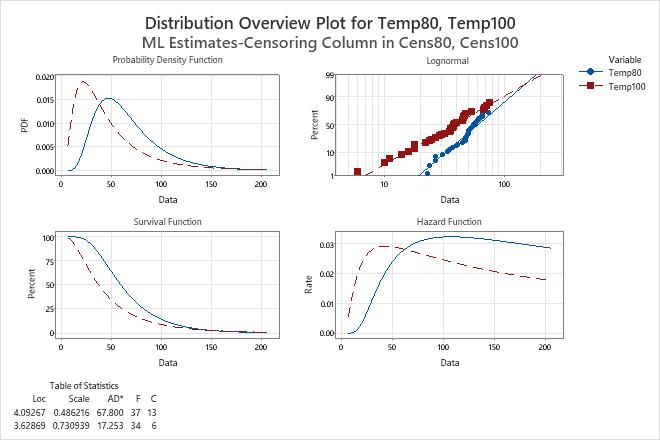
Example output
Interpretation
On the probability plot for the engine windings data, the fitted lines for both variables are based on a lognormal distribution.
For each variable, the data appear to follow the fitted line. Therefore, the lognormal distribution appears to be an appropriate distribution to model the data.