A reliability engineer wants to assess the reliability of a new type of muffler and to estimate the proportion of warranty claims that can be expected with a 50,000-mile warranty. The engineer collects failure data on both the old type and the new type of mufflers. Mufflers were inspected for failure every 10,000 miles.
The engineer records the number of failures for each 10,000-mile interval. Therefore, the data are arbitrarily censored. The engineer uses Distribution Overview Plot (Arbitrary Censoring) to fit a Weibull distribution to the data and to visually assess the survival and failure rates over time.
- Open the sample data, MufflerReliability.MWX.
- Choose .
- In Start variables, enter StartOld StartNew.
- In End variables, enter EndOld EndNew.
- In Frequency columns (optional), enter FreqOld FreqNew.
- Select Parametric analysis. From Distribution, select Weibull.
- Click OK.
Interpret the results
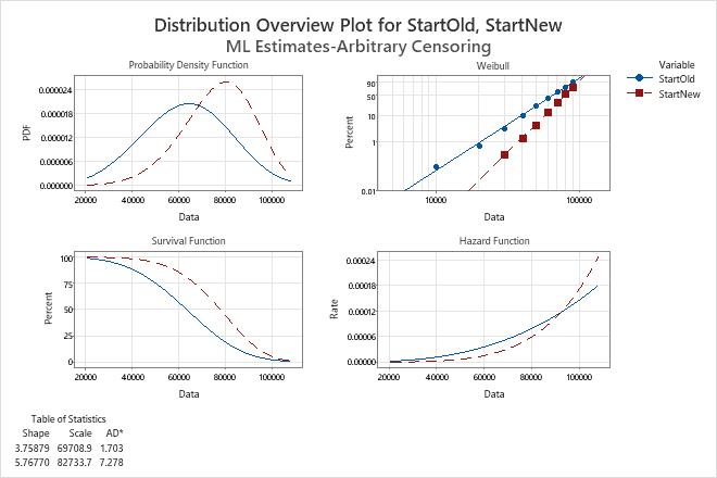
The probability plot indicates that the Weibull distribution is a good fit for these data for both variables.
Use the hazard function plot to compare the failure rate for different variables. For example, the rate of failure for the new muffler design is less than the failure rate for the old design at usage of less than approximately 90,000 miles.
Use the survival function plot to compare the survival rate for different variables. For example, the percentage of mufflers that survive is greater for the new muffler design than for the old design across all usage miles.