Note
This command is available with the Predictive Analytics Module. Click here for more information about how to activate the module.
The scatterplot shows the actual response values on the x-axis and the fitted response values on the y-axis. The calculated line represents when the actual value and the response value are equal. Outliers or unusual clusters of points in the validation results can indicate data that deserve more investigation.
Interpretation
Ideally, the line goes through the middle of the points and the points are close to the line, relative to the scale of the response variable. When you have use a validation technique, Minitab creates separate plots for the training data and for the validation results. You can compare the plots to examine the relative performance of the tree on the training data and on new data. You can also look for different patterns that could indicate a difference to investigate between the training data and the validation results.
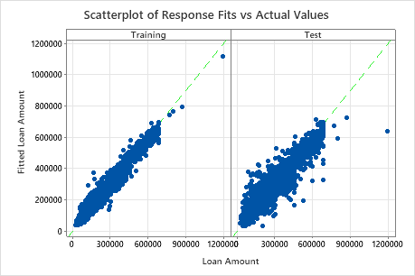
The scatterplot of fitted loan amounts versus actual loan amounts shows the relationship between the fitted and actual values for both the training data and the cross-validation results. You can hover over the points on the graph to see the plotted values more easily. In this example, all points fall approximately near the reference line of y=x.