Note
This command is available with the Predictive Analytics Module. Click here for more information about how to activate the module.
A team of researchers wants to use data about a borrower and the location of a property to predict the amount of a mortgage. Variables include the income, race, and gender of the borrower as well as the census tract location of the property, and other information about the borrower and the type of property.
After initial exploration with CART® Regression to identify the important predictors, the team now considers TreeNet® Regression as a necessary follow-up step. The researchers hope to gain more insight into the relationships between the response and the important predictors and predict for new observations with greater accuracy.
These data were adapted based on a public data set containing information on federal home loan bank mortgages. Original data is from fhfa.gov.
- Open the sample data set PurchasedMortgages.MWX.
- Choose .
- In Response, enter 'Loan Amount'.
- In Continuous predictors, enter 'Annual Income' – 'Area Income'.
- In Categorical predictors, enter 'First Time Home Buyer' – 'Core Based Statistical Area'.
- Click Validation.
- In Validation method, select K-fold cross-validation.
- In Number of folds (K), enter 3.
- Click OK in each dialog box.
Interpret the results
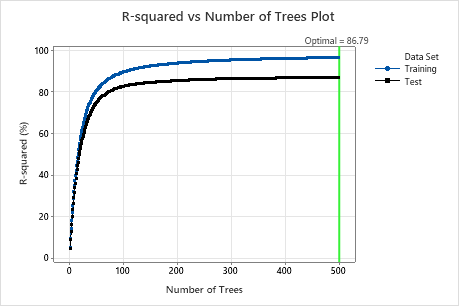
For this analysis, Minitab grows 300 trees and the optimal number of trees is 300. Because the optimal number of trees is close to the maximum number of trees that the model grows, the researchers repeat the analysis with more trees.
Model Summary
| Total predictors | 34 |
|---|---|
| Important predictors | 19 |
| Number of trees grown | 300 |
| Optimal number of trees | 300 |
| Statistics | Training | Cross-validation |
|---|---|---|
| R-squared | 94.02% | 84.97% |
| Root mean squared error (RMSE) | 32334.5587 | 51227.9431 |
| Mean squared error (MSE) | 1.04552E+09 | 2.62430E+09 |
| Mean absolute deviation (MAD) | 22740.1020 | 35974.9695 |
| Mean absolute percent error (MAPE) | 0.1238 | 0.1969 |
Example with 500 trees
- Select Tune Hyperparameters in the results.
- In Number of trees, enter 500.
- Click Display Results.
Interpret the results
For this analysis, there were 500 trees grown and the optimal number of trees for the combination of hyperparameters with the best value of the accuracy criterion is 500. The subsample fraction changes to 0.7 instead of the 0.5 in the original analysis. The learning rate changes to 0.0437 instead of 0.04372 in the original analysis.
Examine both the Model summary table and the R-squared vs Number of Trees Plot. The R2 value when the number of trees is 500 is 86.79% for the validation results and is 96.41% for the training data. These results show improvement over a traditional regression analysis and a CART® Regression.
Method
| Loss function | Squared error |
|---|---|
| Criterion for selecting optimal number of trees | Maximum R-squared |
| Model validation | 3-fold cross-validation |
| Learning rate | 0.04372 |
| Subsample fraction | 0.5 |
| Maximum terminal nodes per tree | 6 |
| Minimum terminal node size | 3 |
| Number of predictors selected for node splitting | Total number of predictors = 34 |
| Rows used | 4372 |
Response Information
| Mean | StDev | Minimum | Q1 | Median | Q3 | Maximum |
|---|---|---|---|---|---|---|
| 235217 | 132193 | 23800 | 136000 | 208293 | 300716 | 1190000 |
Method
| Loss function | Squared error |
|---|---|
| Criterion for selecting optimal number of trees | Maximum R-squared |
| Model validation | 3-fold cross-validation |
| Learning rate | 0.001, 0.0437, 0.1 |
| Subsample fraction | 0.5, 0.7 |
| Maximum terminal nodes per tree | 6 |
| Minimum terminal node size | 3 |
| Number of predictors selected for node splitting | Total number of predictors = 34 |
| Rows used | 4372 |
Response Information
| Mean | StDev | Minimum | Q1 | Median | Q3 | Maximum |
|---|---|---|---|---|---|---|
| 235217 | 132193 | 23800 | 136000 | 208293 | 300716 | 1190000 |
Optimization of Hyperparameters
| Model | Optimal Number of Trees | R-squared (%) | Mean Absolute Deviation | Learning Rate | Subsample Fraction | Maximum Terminal Nodes |
|---|---|---|---|---|---|---|
| 1 | 500 | 36.43 | 82617.1 | 0.0010 | 0.5 | 6 |
| 2 | 495 | 85.87 | 34560.5 | 0.0437 | 0.5 | 6 |
| 3 | 495 | 85.63 | 34889.3 | 0.1000 | 0.5 | 6 |
| 4 | 500 | 36.86 | 82145.0 | 0.0010 | 0.7 | 6 |
| 5* | 500 | 86.79 | 33052.6 | 0.0437 | 0.7 | 6 |
| 6 | 451 | 86.67 | 33262.3 | 0.1000 | 0.7 | 6 |
Model Summary
| Total predictors | 34 |
|---|---|
| Important predictors | 24 |
| Number of trees grown | 500 |
| Optimal number of trees | 500 |
| Statistics | Training | Cross-validation |
|---|---|---|
| R-squared | 96.41% | 86.79% |
| Root mean squared error (RMSE) | 25035.7243 | 48029.9503 |
| Mean squared error (MSE) | 6.26787E+08 | 2.30688E+09 |
| Mean absolute deviation (MAD) | 17309.3936 | 33052.6087 |
| Mean absolute percent error (MAPE) | 0.0930 | 0.1790 |
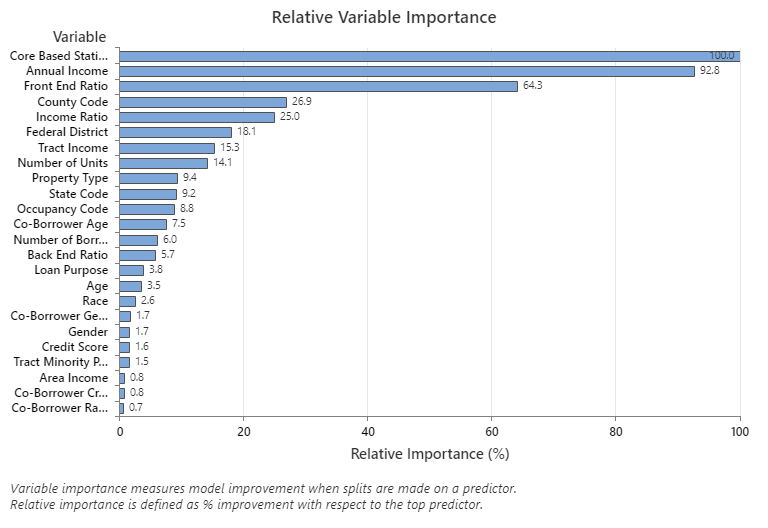
The Relative Variable Importance graph plots the predictors in order of their effect on model improvement when splits are made on a predictor over the sequence of trees. The most important predictor variable is Core Based Statistical Area. If the importance of the top predictor variable, Core Based Statistical Area, is 100%, then the next important variable, Annual Income, has a contribution of 92.8%. This means the annual income of the borrower is 92.8% as important as the geographical location of the property.
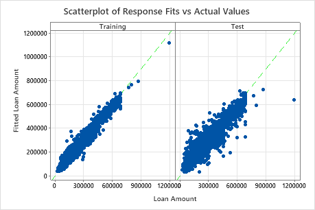
The scatterplot of fitted loan amounts versus actual loan amounts shows the relationship between the fitted and actual values for both the training data and for the cross-validation results. You can hover over the points on the graph to see the plotted values more easily. In this example, all points fall approximately near the reference line of y=x.
Use the partial dependency plots to gain insight into how the important variables or pairs of variables affect the fitted response values. The partial dependence plots show whether the relationship between the response and a variable is linear, monotonic, or more complex.
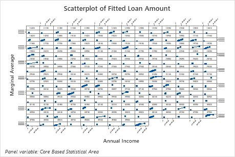
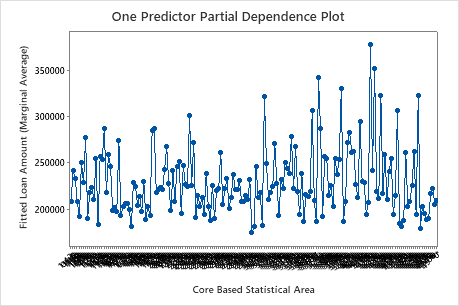
The first plot illustrates the fitted loan amount for each core based statistical area. Because there are so many data points, you can hover over individual data points to see the specific x– and y–values. For instance, the highest point on the right side of the graph is for core area number 41860 and the fitted loan amount is approximately $378069.
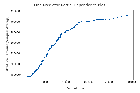
The second plot illustrates that the fitted loan amount increases as the annual income increases. After annual income reaches $300000, the fitted loan amount levels increase at a slower rate.
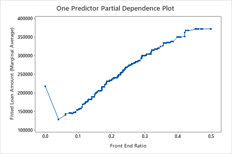
The third plot illustrates that the fitted loan amount increases as the front end ratio increases.
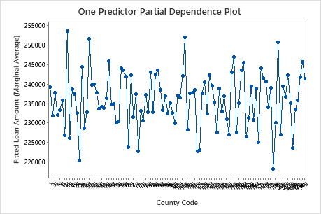 The fourth plot
illustrates the fitted loan amount for each census county code. As with the first plot,
you can hover over certain data points to get more information. Select or to produce plots for other variables.
The fourth plot
illustrates the fitted loan amount for each census county code. As with the first plot,
you can hover over certain data points to get more information. Select or to produce plots for other variables.