Note
This command is available with the Predictive Analytics Module. Click here for more information about how to activate the module.
Note
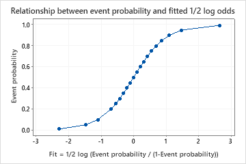
Odds = event prob / (1-event prob)
One Predictor Partial Dependence Plot
The one predictor partial dependence plot displays how the average fit which represents the event probability changes with changes in the predictor levels.
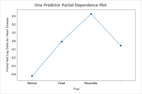
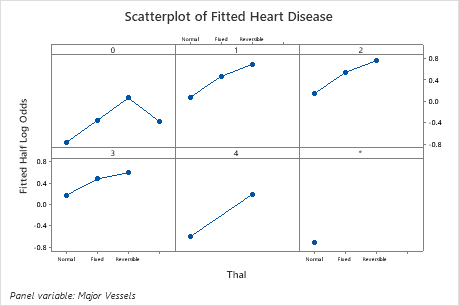
This plot illustrates that the probability of a heart disease event increases as the type of defect changes from normal to fixed to reversible. The last category is where the data are missing for this variable.
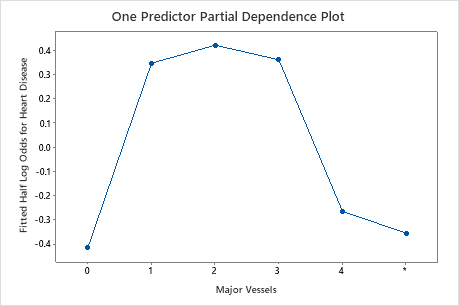
The second plot illustrates that highest probability for a heart disease event are with the number of major vessels colored with fluoroscopy between 1 and 3.
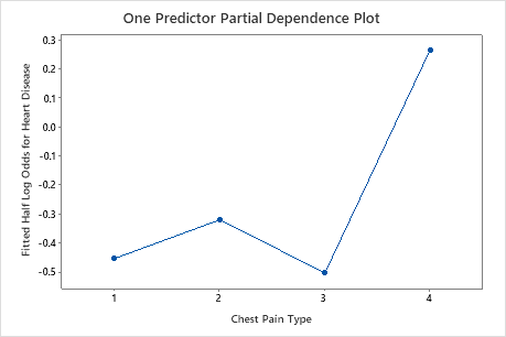
The third plot illustrates that when the chest pain type is 4, the average 1/2 log odds of heart disease incidence increases from approximately −0.05 through −0.03 to 0.03.
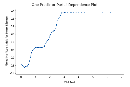
The fourth plot shows that the higher the old peak value, the more likely to have heart disease until the value reaches 3, then the probability is flat.
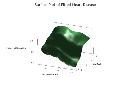
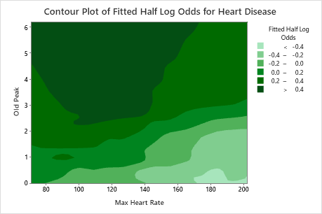
Two Predictor Partial Dependence Plot
The two predictor partial dependence plot shows the interaction effects of the plotted predictors on the fits. Because of the relationship between the fits and the event probability, you can use this plot to help identify optimal predictor values. Event probability monotonically increases as fits increases.
The two predictor partial dependence plot indicates how the response will change with changes in the predictor levels of two important variables. For categorical predictors, Minitab displays a matrix plot of the various relationships at the various levels of the predictors. For continuous predictors, Minitab displays a surface plot or a contour plot of this relationship.
The surface and contour plots illustrates that highest probability for a favorable rating are with max heart rate between 100 and 120 and old peak between 5 and 6.