Note
This command is available with the Predictive Analytics Module. Click here for more information about how to activate the module.
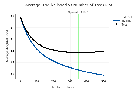
The Average-Log-Likelihood vs Number of Trees Plot plots the average negative log-likelihood on the y-axis and the number of trees on the x-axis. The average negative log-likelihood indicates whether the model is a good classifier. When the analysis uses a validation method, the plot includes a line for the validation results. Use the validation results to assess the performance of the model to predict new observations. Compare the training results and the validation results to see whether there are overfitting problems with the model for the training data set.
When the area under the ROC curve determines the number of trees for the optimal model, then Minitab displays the Area Under ROC Curve vs Number of Trees plot. When the minimum misclassification rate determines the number of trees for the optimal model, then Minitab displays the Misclassification Rate vs Number of Trees plot.
Interpretation
Lower values indicate a better classification model. The reference line indicates the optimal average negative log-likelihood for the validation results and the number of trees in the model. If the curve for the validation results indicates an insufficient model, consider whether to retry the analysis with alternative settings, such as larger or smaller learning rates, or a larger subsample fraction.
