Note
This command is available with the Predictive Analytics Module. Click here for more information about how to activate the module.
A team of researchers collects data from the sale of individual residential properties in Ames, Iowa. The researchers want to identify the variables that affect the sale price. Variables include the lot size and various features of the residential property.
After initial exploration with CART® Regression to identify the important predictors, the team uses Random Forests® Regression to create a more intensive model from the same data set. The team compares the model summary table and the R2 plot from the results to evaluate which model provides a better prediction outcome.
These data were adapted based on a public data set containing information on Ames housing data. Original data from DeCock, Truman State University.
- Open the sample data AmesHousing.MWX.
- Choose .
- In Response, enter 'Sale Price'.
- In Continuous predictors, enter 'Lot Frontage' – 'Year Sold'.
- In Categorical predictors, enter 'Type' – 'Sale Condition'.
- Click Options.
- Under Number of predictors for node splitting, choose K percent of the total number of predictors; K = and enter 30. The researchers want to use more than the default number of predictors for this analysis.
- Click OK in each dialog box.
Interpret the results
Method
| Model validation | Validation with out-of-bag data |
|---|---|
| Number of bootstrap samples | 300 |
| Sample size | Same as training data size of 2930 |
| Number of predictors selected for node splitting | 30% of the total number of predictors = 23 |
| Minimum internal node size | 5 |
| Rows used | 2930 |
Response Information
| Mean | StDev | Minimum | Q1 | Median | Q3 | Maximum |
|---|---|---|---|---|---|---|
| 180796 | 79886.7 | 12789 | 129500 | 160000 | 213500 | 755000 |
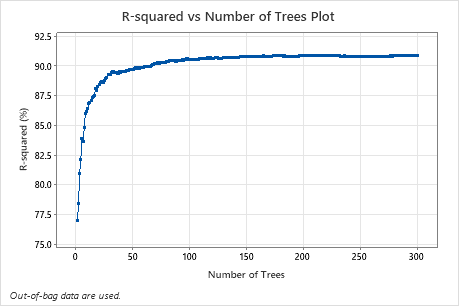
The R-squared vs Number of Trees Plot shows the entire curve over the number of trees grown. The R2 value rapidly increases as the number of trees increases then flattens at approximately 91%.
The Model summary table shows that the R2 values are slightly improved over the R2 values of the corresponding CART® analysis.
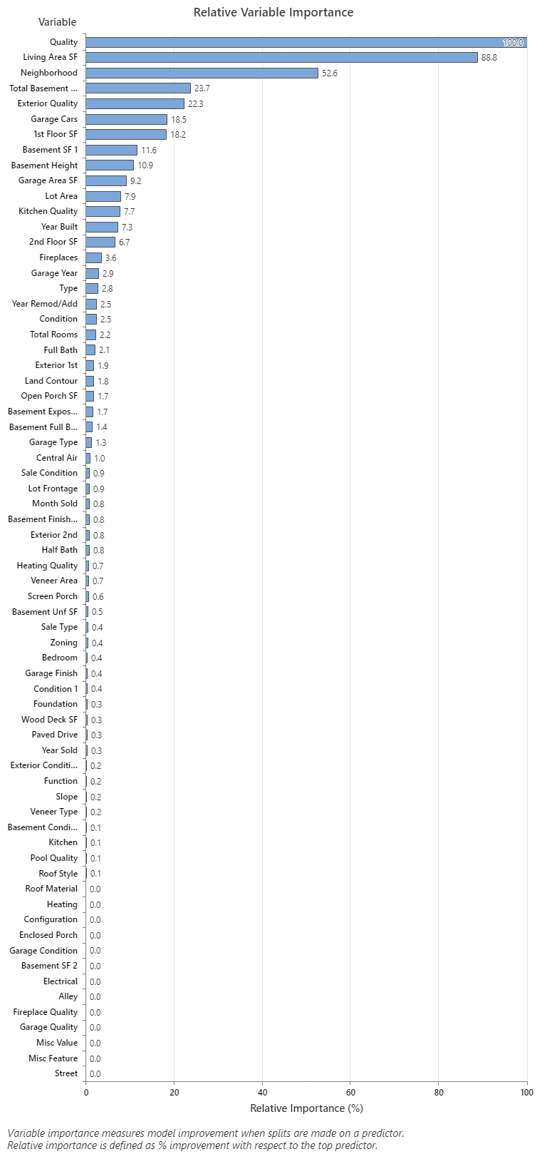
The Relative Variable Importance graph plots the predictors in order of their effect on model improvement when splits are made on a predictor over the sequence of trees. The most important predictor variable for predicting the sale price is Quality. If the importance of the top predictor variable, Quality, is 100%, then the next important variable, Living Area SF, has a contribution of 88.8%. This means that the square footage of the living is 88.8% as important as the overall quality of the property. The next most important variable is Neighborhood which has a contribution of 52.6%.
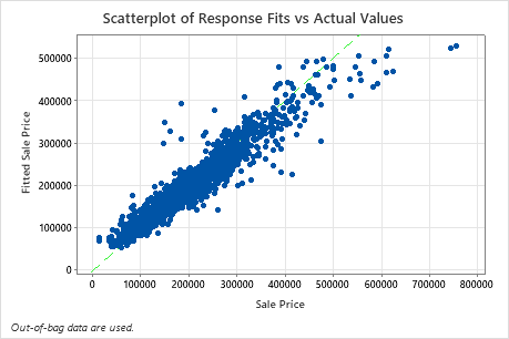
The scatterplot of fitted sale price versus actual sale price shows the relationship between the fitted and actual values for the OOB data. You can hover over the points on the graph to see the plotted values more easily. In this example, many points fall approximately near the reference line of y=x, but several points may need investigation to see discrepancies between fitted and actual values.