Note
This command is available with the Predictive Analytics Module. Click here for more information about how to activate the module.
Search for the best type of model
A team of researchers collects and publishes detailed information about factors that affect heart disease. Variables include age, sex, cholesterol levels, maximum heart rate, and more. This example is based on a public data set that gives detailed information about heart disease. The original data are from archive.ics.uci.edu.
The researchers want to find a model that makes the most accurate predictions that are possible. The researchers use Discover Best Model (Binary Response) to compare the predictive performance of 4 types of models: binary logistic regression, TreeNet®, Random Forests® and CART®. The researchers plan to further explore the type of model with the best predictive performance.
- Open the sample data, HeartDiseaseBinaryBestModel.MWX.
- Choose .
- In Response, enter 'Heart Disease'.
- In Continuous predictors, enter Age, 'Rest Blood Pressure', Cholesterol, 'Max Heart Rate', and ' Old Peak'.
- In Categorical predictors, enter Sex, ' Chest Pain Type', 'Fasting Blood Sugar', 'Rest ECG', 'Exercise Angina', Slope, 'Major Vessels', and Thal.
- Click OK.
Interpret the results
The Model Selection table compares the performance of the different types of models. The Random Forests® model has the minimum value of the average –loglikelihood. The results that follow are for the best Random Forests® model.
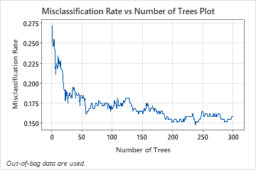
The Misclassification Rate vs Number of Trees Plot shows the entire curve over the number of trees grown. The misclassification rate is approximately 0.16.
The Model summary table shows that the average negative loglikelihood is approximately 0.39.
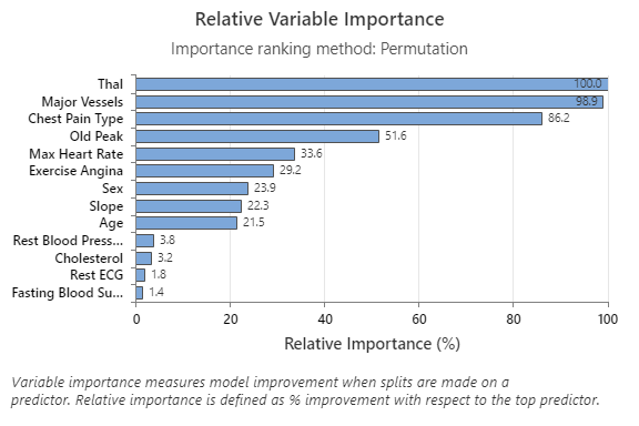
The Relative Variable Importance graph plots the predictors in order of their effect on model improvement when splits are made on a predictor over the sequence of trees. The most important predictor variable is Thal. If the contribution of the top predictor variable, Thal, is 100%, then the next important variable, Major Vessels, has a contribution of 98.9%. This means Major Vessels is 98.9% as important as Thal in this classification model.
The confusion matrix shows how well the model correctly separates the classes. In this example, the probability that an event is predicted correctly is approximately 87%. The probability that a nonevent is predicted correctly is approximately 81%.
The misclassification rate helps indicate whether the model will accurately predict new observations. For prediction of events, the out-of-bag misclassification error is approximately 13%. For the prediction of nonevents, the misclassification error is approximately 19%. Overall, the misclassification error for the test data is approximately 16%.
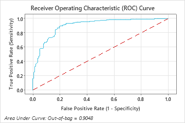
The area under the ROC curve for the Random Forests® model is approximately 0.90 for the out-of-bag data.
Method
| Fit a stepwise logistic regression model with linear terms and terms of order 2. |
|---|
| Fit 6 TreeNet® Classification model(s). |
| Fit 3 Random Forests® Classification model(s) with bootstrap sample size same as training data size of 303. |
| Fit an optimal CART® Classification model. |
| Select the model with maximum loglikelihood from 5-fold cross-valuation. |
| Total number of rows: 303 |
| Rows used for logistic regression model: 303 |
| Rows used for tree-based models: 303 |
Binary Response Information
| Variable | Class | Count | % |
|---|---|---|---|
| Heart Disease | 1 (Event) | 165 | 54.46 |
| 0 | 138 | 45.54 | |
| All | 303 | 100.00 |
| Best Model within Type | Average -Loglikelihood | Area Under ROC Curve | Misclassification Rate |
|---|---|---|---|
| Random Forests®* | 0.3904 | 0.9048 | 0.1584 |
| TreeNet® | 0.3907 | 0.9032 | 0.1520 |
| Logistic Regression | 0.4671 | 0.9142 | 0.1518 |
| CART® | 1.8072 | 0.7991 | 0.2080 |
Hyperparameters for Best Random Forests® Model
| Number of bootstrap samples | 300 |
|---|---|
| Sample size | Same as training data size of 303 |
| Number of predictors selected for node splitting | Square root of the total number of predictors = 3 |
| Minimum internal node size | 8 |
Model Summary
| Total predictors | 13 |
|---|---|
| Important predictors | 13 |
| Statistics | Out-of-Bag |
|---|---|
| Average -loglikelihood | 0.3904 |
| Area under ROC curve | 0.9048 |
| 95% CI | (0.8706, 0.9389) |
| Lift | 1.7758 |
| Misclassification rate | 0.1584 |
Confusion Matrix
| Predicted Class (Out-of-Bag) | ||||
|---|---|---|---|---|
| Actual Class | Count | 1 | 0 | % Correct |
| 1 (Event) | 165 | 143 | 22 | 86.67 |
| 0 | 138 | 26 | 112 | 81.16 |
| All | 303 | 169 | 134 | 84.16 |
| Statistics | Out-of-Bag (%) |
|---|---|
| True positive rate (sensitivity or power) | 86.67 |
| False positive rate (type I error) | 18.84 |
| False negative rate (type II error) | 13.33 |
| True negative rate (specificity) | 81.16 |
Misclassification
| Out-of-Bag | |||
|---|---|---|---|
| Actual Class | Count | Misclassed | % Error |
| 1 (Event) | 165 | 22 | 13.33 |
| 0 | 138 | 26 | 18.84 |
| All | 303 | 48 | 15.84 |
Select an alternative model
The researchers can look at results for other models from the search for the best model. For a TreeNet® model, you can select from a model that was part of the search or specify hyperparameters for a different model.
- Select Select Alternative Model.
- In Model Type, select TreeNet®.
- In Select an existing model, choose the third model, which has the best value of the minimum average –loglikelihood.
- Click Display Results.
Interpret the results
This analysis grows 300 trees and the optimal number of trees is 46. The model uses a learning rate of 0.1 and a subsample fraction of 0.5. The maximum number of terminal nodes per tree is 6.
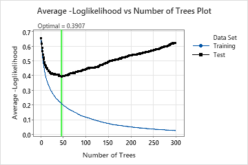
The Average –Loglikelihood vs Number of Trees Plot shows the entire curve over the number of trees grown. The optimal value from cross-validation is 0.3907 when the number of trees is 46.
Model Summary
| Total predictors | 13 |
|---|---|
| Important predictors | 13 |
| Number of trees grown | 300 |
| Optimal number of trees | 46 |
| Statistics | Training | Cross-validation |
|---|---|---|
| Average -loglikelihood | 0.2088 | 0.3907 |
| Area under ROC curve | 0.9842 | 0.9032 |
| 95% CI | (0.9721, 0.9964) | (0.8683, 0.9381) |
| Lift | 1.8364 | 1.7744 |
| Misclassification rate | 0.0726 | 0.1520 |
When the number of trees is 46, the Model summary table indicates that the average negative loglikelihood is approximately 0.21 for the training data and approximately 0.39 for the cross-validation results.
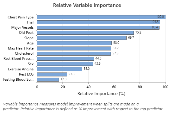
The Relative Variable Importance graph plots the predictors in order of their effect on model improvement when splits are made on a predictor over the sequence of trees. The most important predictor variable is Chest Pain Type. If the contribution of the top predictor variable, Chest Pain Type, is 100%, then the next important variable, Thal, has a contribution of 95.8%. This means that Thal is 95.8% as important as Chest Pain Type in this classification model.
Confusion Matrix
| Predicted Class (Training) | Predicted Class (Cross-validation) | ||||||
|---|---|---|---|---|---|---|---|
| Actual Class | Count | 1 | 0 | % Correct | 1 | 0 | % Correct |
| 1 (Event) | 165 | 156 | 9 | 94.55 | 147 | 18 | 89.09 |
| 0 | 138 | 13 | 125 | 90.58 | 28 | 110 | 79.71 |
| All | 303 | 169 | 134 | 92.74 | 175 | 128 | 84.82 |
| Statistics | Training (%) | Cross-validation (%) |
|---|---|---|
| True positive rate (sensitivity or power) | 94.55 | 89.09 |
| False positive rate (type I error) | 9.42 | 20.29 |
| False negative rate (type II error) | 5.45 | 10.91 |
| True negative rate (specificity) | 90.58 | 79.71 |
The confusion matrix shows how well the model correctly separates the classes. In this example, the probability that an event is predicted correctly is approximately 89%. The probability that a nonevent is predicted correctly is approximately 80%.
Misclassification
| Training | Cross-validation | ||||
|---|---|---|---|---|---|
| Actual Class | Count | Misclassed | % Error | Misclassed | % Error |
| 1 (Event) | 165 | 9 | 5.45 | 18 | 10.91 |
| 0 | 138 | 13 | 9.42 | 28 | 20.29 |
| All | 303 | 22 | 7.26 | 46 | 15.18 |
The misclassification rate helps to indicate whether the model will accurately predict new observations. For the prediction of events, the misclassification error from cross-validation is approximately 11%. For the prediction of nonevents, the misclassification error is approximately 20%. Overall, the misclassification error from cross-validation is approximately 15%.
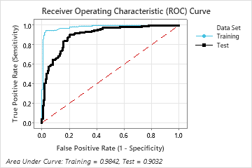
The area under the ROC curve when the number of trees is 46 is approximately 0.98 for the training data and is approximately 0.90 for the cross-validation results.
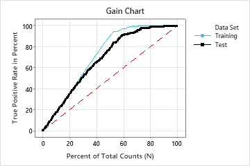
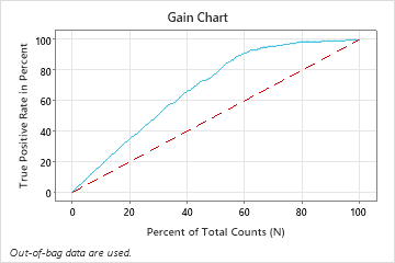
In this example, the gain chart shows a sharp increase above the reference line, then a flattening. In this case, approximately 60% of the data account for approximately 90% of the true positives. This difference is the extra gain from using the model.
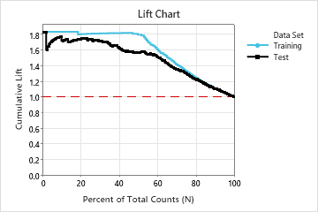
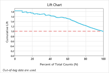
In this example, the lift chart shows a large increase above the reference line that begins to decline faster after approximately 50% of the total count.
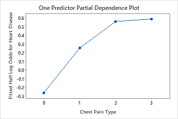
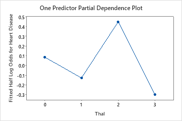
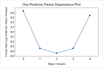
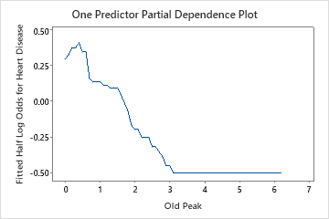
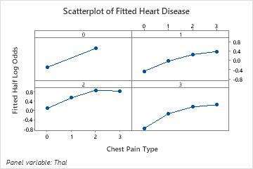
Use the partial dependency plots to gain insight into how the important variables or pairs of variables affect the fitted response values. The fitted response values are on the 1/2 log scale. The partial dependence plots show whether the relationship between the response and a variable is linear, monotonic, or more complex.
For example, in the partial dependence plot of the chest pain type, the 1/2 log odds is highest at the value of 3. Select or to produce plots for other variables