In This Topic
Step 1: Determine the number of principal components
Use the proportion of inertia to determine the minimum number of principal components, also called principal axes, that account for most of the deviation from the expected values in the data. Retain the principal components that explain an acceptable proportion of total inertia. The acceptable level depends on your application. Ideally, the first one, two, or three components account for most of the total inertia.
If the minimum number of principal components needed does not match the number of components that you entered for the analysis, repeat the analysis using the appropriate number of components.
Analysis of Contingency Table
| Axis | Inertia | Proportion | Cumulative |
|---|---|---|---|
| 1 | 0.0391 | 0.4720 | 0.4720 |
| 2 | 0.0304 | 0.3666 | 0.8385 |
| 3 | 0.0109 | 0.1311 | 0.9697 |
| 4 | 0.0025 | 0.0303 | 1.0000 |
| Total | 0.0829 |
Key Results: Axes, Proportion, Cumulative
These results show the decomposition of total inertia of a 10 x 5 contingency table into 4 components (axes). The total inertia explained by the four components is 0.0829. Of the total inertia, the first component accounts for 47.2% of the inertia (Proportion = 0.4720) and the second component accounts for 36.66% of the inertia (Proportion = 0.3666). Together, these 2 components account for 83.85% of the total inertia (Cumulative = 0.8385). Therefore, specifying 2 components for the analysis may be sufficient.
Step 2: Interpret the principal components
Use the quality values to determine the proportion of the row inertia or column inertia represented by the components. Quality is always a number between 0 and 1. Larger quality values indicate that the row or column is well represented by the components. Lower values indicate poorer representation. The quality values for the rows and columns can help you interpret the components.
Use the contribution values for the rows and/or columns assess which column and row categories contribute most to the inertia of each component. To visually interpret the components, use a row or column plot.
Row Contributions
| Component 1 | Component 2 | |||||||||
|---|---|---|---|---|---|---|---|---|---|---|
| ID | Name | Qual | Mass | Inert | Coord | Corr | Contr | Coord | Corr | Contr |
| 1 | Geology | 0.916 | 0.107 | 0.137 | -0.076 | 0.055 | 0.016 | -0.303 | 0.861 | 0.322 |
| 2 | Biochemistry | 0.881 | 0.036 | 0.119 | -0.180 | 0.119 | 0.030 | 0.455 | 0.762 | 0.248 |
| 3 | Chemistry | 0.644 | 0.163 | 0.021 | -0.038 | 0.134 | 0.006 | -0.073 | 0.510 | 0.029 |
| 4 | Zoology | 0.929 | 0.151 | 0.230 | 0.327 | 0.846 | 0.413 | -0.102 | 0.083 | 0.052 |
| 5 | Physics | 0.886 | 0.143 | 0.196 | -0.316 | 0.880 | 0.365 | -0.027 | 0.006 | 0.003 |
| 6 | Engineering | 0.870 | 0.111 | 0.152 | 0.117 | 0.121 | 0.039 | 0.292 | 0.749 | 0.310 |
| 7 | Microbiology | 0.680 | 0.046 | 0.010 | -0.013 | 0.009 | 0.000 | 0.110 | 0.671 | 0.018 |
| 8 | Botany | 0.654 | 0.108 | 0.067 | 0.179 | 0.625 | 0.088 | 0.039 | 0.029 | 0.005 |
| 9 | Statistics | 0.561 | 0.036 | 0.012 | -0.125 | 0.554 | 0.014 | -0.014 | 0.007 | 0.000 |
| 10 | Mathematics | 0.319 | 0.098 | 0.056 | -0.107 | 0.240 | 0.029 | 0.061 | 0.079 | 0.012 |
Key Results: Qual, Contr, Row/Column plot
In this analysis, Minitab calculates two principal components. In the Row Contributions table, highest quality values occur for Zoology (0.929) and Geology (0.916). Therefore, these two rows are best represented by the two components. Mathematics has the poorest representation, with a quality value of 0.319.
Zoology (0.413) and Physics (0.365) contribute the most to the inertia of Component 1. Geology (0.322), Engineering (0.310, and Biochemistry (0.248) contribute the most to the inertia of Component 2.
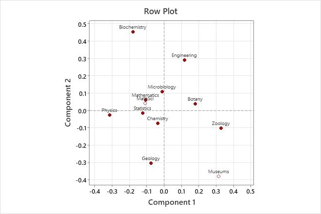
The row plot shows the row principal coordinates. Component 1, which best explains Zoology and Physics, shows these two fields farthest from the origin, but with opposite signs. Therefore, component 1 contrasts the biological sciences Zoology and Botany with Physics. Component 2 contrasts Biochemistry and Engineering with Geology.
Step 3: Examine relationships among categories
Examine calculated inertia values for the row and column categories and look for possible associations. Categories with stronger associations have a higher inertia value, which indicates they contribute more to the total chi-squared value.
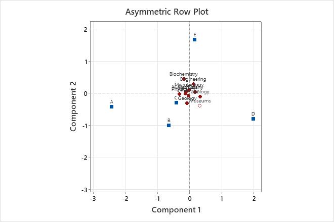
You can also use an asymmetric row or column plot to visually examine possible relationships. For a row plot, the closer a row profile is to a column vertex, the higher the row profile is with respect to the column category. For a column plot, the closer a column profile is to a row vertex, the higher the column profile is with respect to the row category.
Row Contributions
| Component 1 | Component 2 | |||||||||
|---|---|---|---|---|---|---|---|---|---|---|
| ID | Name | Qual | Mass | Inert | Coord | Corr | Contr | Coord | Corr | Contr |
| 1 | Geology | 0.916 | 0.107 | 0.137 | -0.076 | 0.055 | 0.016 | -0.303 | 0.861 | 0.322 |
| 2 | Biochemistry | 0.881 | 0.036 | 0.119 | -0.180 | 0.119 | 0.030 | 0.455 | 0.762 | 0.248 |
| 3 | Chemistry | 0.644 | 0.163 | 0.021 | -0.038 | 0.134 | 0.006 | -0.073 | 0.510 | 0.029 |
| 4 | Zoology | 0.929 | 0.151 | 0.230 | 0.327 | 0.846 | 0.413 | -0.102 | 0.083 | 0.052 |
| 5 | Physics | 0.886 | 0.143 | 0.196 | -0.316 | 0.880 | 0.365 | -0.027 | 0.006 | 0.003 |
| 6 | Engineering | 0.870 | 0.111 | 0.152 | 0.117 | 0.121 | 0.039 | 0.292 | 0.749 | 0.310 |
| 7 | Microbiology | 0.680 | 0.046 | 0.010 | -0.013 | 0.009 | 0.000 | 0.110 | 0.671 | 0.018 |
| 8 | Botany | 0.654 | 0.108 | 0.067 | 0.179 | 0.625 | 0.088 | 0.039 | 0.029 | 0.005 |
| 9 | Statistics | 0.561 | 0.036 | 0.012 | -0.125 | 0.554 | 0.014 | -0.014 | 0.007 | 0.000 |
| 10 | Mathematics | 0.319 | 0.098 | 0.056 | -0.107 | 0.240 | 0.029 | 0.061 | 0.079 | 0.012 |
Key Results: Inert, Asymmetric Row/Column plot
In the Row Contributions table, the column labeled Inert is the proportion of the total inertia contributed by each row. Thus, Geology contributes 13.7% to the total chi-squared statistic. Zoology has the highest inertia value (0.230). Therefore Zoology contributes 23% to the total chi-squared value and has a stronger association with the column categories (funding) than the other row categories.
In the asymmetric row plot, the row points represent academic disciplines and the column points represent funding levels (A is the highest level of funding and D is the lowest. E indicates no funding). Biochemistry is closest to column category E, implying that biochemistry as a discipline has the highest percentage of unfunded researchers in this study.