In This Topic
Step 1: Determine the number of principal components
Use the proportion of inertia to determine the minimum number of principal components, also called principal axes, that account for most of the deviation from the expected values in the data. Retain the principal components that explain an acceptable proportion of total inertia. The acceptable level depends on your application. Ideally, the first one, two, or three components account for most of the total inertia.
If the minimum number of principal components needed does not match the number of components that you entered for the analysis, repeat the analysis using the appropriate number of components.
Analysis of Indicator Matrix
| Axis | Inertia | Proportion | Cumulative | Histogram |
|---|---|---|---|---|
| 1 | 0.4032 | 0.4032 | 0.4032 | ****************************** |
| 2 | 0.2520 | 0.2520 | 0.6552 | ****************** |
| 3 | 0.1899 | 0.1899 | 0.8451 | ************** |
| 4 | 0.1549 | 0.1549 | 1.0000 | *********** |
| Total | 1.0000 |
Key Results: Axes, proportion, cumulative proportion
These results show the decomposition of total inertia into 4 components. The total inertia explained by the four components is 1.000. Of the total inertia, the first component (axis) accounts for 40.32% of the inertia and the second component accounts for 25.20% of the inertia. Together, these 2 components account for 65.52% of the total inertia. Therefore, specifying 2 components for the analysis may not be sufficient. Adding a 3rd component increases the cumulative proportion of inertia to 84.51%.
Step 2: Interpret the principal components
Use the quality values to determine the proportion of inertia represented by the components for each category. Quality is always a number between 0 and 1. Larger quality values indicate that the category is well represented by the components. Lower values indicate poorer representation. The quality values help you interpret the components.
Use the contribution values for the columns to assess which categories contribute most to the inertia of each component. To visually interpret the components, use the column plot.
Analysis of Indicator Matrix
| Axis | Inertia | Proportion | Cumulative | Histogram |
|---|---|---|---|---|
| 1 | 0.4032 | 0.4032 | 0.4032 | ****************************** |
| 2 | 0.2520 | 0.2520 | 0.6552 | ****************** |
| 3 | 0.1899 | 0.1899 | 0.8451 | ************** |
| 4 | 0.1549 | 0.1549 | 1.0000 | *********** |
| Total | 1.0000 |
Column Contributions
| Component 1 | Component 2 | |||||||||
|---|---|---|---|---|---|---|---|---|---|---|
| ID | Name | Qual | Mass | Inert | Coord | Corr | Contr | Coord | Corr | Contr |
| 1 | Small | 0.9655 | 0.0424 | 0.2076 | 0.3814 | 0.0297 | 0.0153 | -2.1394 | 0.9357 | 0.7707 |
| 2 | Standard | 0.9655 | 0.2076 | 0.0424 | -0.0780 | 0.0297 | 0.0031 | 0.4374 | 0.9357 | 0.1576 |
| 3 | NoEject | 0.4739 | 0.2134 | 0.0366 | -0.2844 | 0.4717 | 0.0428 | -0.0197 | 0.0023 | 0.0003 |
| 4 | Eject | 0.4739 | 0.0366 | 0.2134 | 1.6587 | 0.4717 | 0.2497 | 0.1151 | 0.0023 | 0.0019 |
| 5 | Collis | 0.6133 | 0.1926 | 0.0574 | -0.4264 | 0.6095 | 0.0868 | 0.0338 | 0.0038 | 0.0009 |
| 6 | Rollover | 0.6133 | 0.0574 | 0.1926 | 1.4294 | 0.6095 | 0.2911 | -0.1133 | 0.0038 | 0.0029 |
| 7 | NoSevere | 0.5680 | 0.1353 | 0.1147 | -0.6523 | 0.5018 | 0.1428 | -0.2371 | 0.0663 | 0.0302 |
| 8 | Severe | 0.5680 | 0.1147 | 0.1353 | 0.7692 | 0.5018 | 0.1684 | 0.2795 | 0.0663 | 0.0356 |
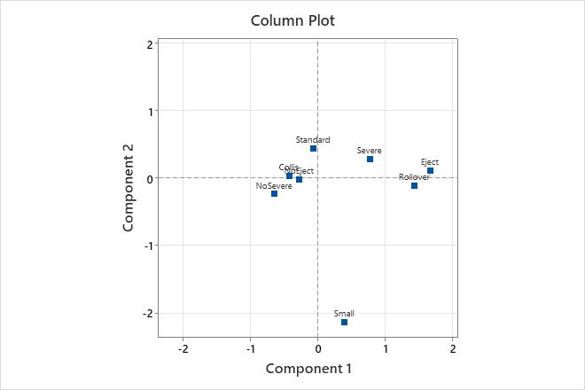
Key Results: Qual, Contr, Column plot
In this analysis, Minitab calculates two principal components for data related to car accidents. In the Column Contributions table, the highest quality values occur for the car sizes Small (0.965) and Standard (0.965). Therefore, these two categories are best represented by the two components. Accident severity has the poorest representation, with a quality value of 0.568 for both Severe and NoSevere. Rollover (0.291) and Eject (0.250) contribute the most to the inertia of Component 1. Car sizes Small (0.771) and Standard (0.158) contribute the most to the inertia of Component 2. However, these results should be interpreted with caution, because two components may not adequately explain the variability of these data.
The column plot shows the column principal coordinates. Component 1 best explains Rollover and Eject, with these two categories farthest from the origin on the horizontal axis. Severe and No Severe are on opposite sides of the origin on the horizontal axis. Therefore, Component 1 contrasts these category values. Component 2 is shown on the vertical axis. Component 2 best explains Small car size, and contrasts it with the other categories.
Step 3: Examine the inertia of the categories
Examine calculated inertia values for the column categories. Categories that deviate more from their expected value have a higher inertia value and contribute more to the total chi-squared value.
Column Contributions
| Component 1 | Component 2 | |||||||||
|---|---|---|---|---|---|---|---|---|---|---|
| ID | Name | Qual | Mass | Inert | Coord | Corr | Contr | Coord | Corr | Contr |
| 1 | Small | 0.9655 | 0.0424 | 0.2076 | 0.3814 | 0.0297 | 0.0153 | -2.1394 | 0.9357 | 0.7707 |
| 2 | Standard | 0.9655 | 0.2076 | 0.0424 | -0.0780 | 0.0297 | 0.0031 | 0.4374 | 0.9357 | 0.1576 |
| 3 | NoEject | 0.4739 | 0.2134 | 0.0366 | -0.2844 | 0.4717 | 0.0428 | -0.0197 | 0.0023 | 0.0003 |
| 4 | Eject | 0.4739 | 0.0366 | 0.2134 | 1.6587 | 0.4717 | 0.2497 | 0.1151 | 0.0023 | 0.0019 |
| 5 | Collis | 0.6133 | 0.1926 | 0.0574 | -0.4264 | 0.6095 | 0.0868 | 0.0338 | 0.0038 | 0.0009 |
| 6 | Rollover | 0.6133 | 0.0574 | 0.1926 | 1.4294 | 0.6095 | 0.2911 | -0.1133 | 0.0038 | 0.0029 |
| 7 | NoSevere | 0.5680 | 0.1353 | 0.1147 | -0.6523 | 0.5018 | 0.1428 | -0.2371 | 0.0663 | 0.0302 |
| 8 | Severe | 0.5680 | 0.1147 | 0.1353 | 0.7692 | 0.5018 | 0.1684 | 0.2795 | 0.0663 | 0.0356 |
Key Results: Column inertia
In the Column Contributions table, the column labeled Inert is the proportion of the total inertia contributed by each category. Thus, Eject deviates most from its expected value and contributes 21.3% to the total chi-squared statistic.