In This Topic
Axis
Minitab calculates each principle axis, which is also called a principal component. Minitab orders the principal components by how much they account for the total inertia. The first principal component (axis) accounts for the most inertia. The second principal component (axis) accounts for most of the remaining inertia, and so on.
Interpretation
Use the principle axes to evaluate which components account for most of the variability in the data.
Analysis of Indicator Matrix
| Axis | Inertia | Proportion | Cumulative | Histogram |
|---|---|---|---|---|
| 1 | 0.4032 | 0.4032 | 0.4032 | ****************************** |
| 2 | 0.2520 | 0.2520 | 0.6552 | ****************** |
| 3 | 0.1899 | 0.1899 | 0.8451 | ************** |
| 4 | 0.1549 | 0.1549 | 1.0000 | *********** |
| Total | 1.0000 |
These results show the decomposition of total inertia into 4 components. The total inertia explained by the four components is 1.000. Of the total inertia, the first component accounts for 40.32% of the inertia and the second component accounts for 25.20% of the inertia. Together, these 2 components account for 65.52% of the total inertia. Therefore, specifying 2 components for the analysis may not be sufficient. Adding a 3rd component increases the cumulative proportion of inertia to 84.51%.
Inertia
The inertia for a component describes the amount of variation the component explains. The inertia for a column describes how much the values for that category differ from the expected value under the assumption that none of the categorical variables are correlated. To calculate the inertia for a component, Minitab multiplies the inertia for each category by the category's correlation for that component, and then sums the resulting products.
Interpretation
Use the inertia of the components to determine which components account for most of the variability in the data.
Analysis of Indicator Matrix
| Axis | Inertia | Proportion | Cumulative | Histogram |
|---|---|---|---|---|
| 1 | 0.4032 | 0.4032 | 0.4032 | ****************************** |
| 2 | 0.2520 | 0.2520 | 0.6552 | ****************** |
| 3 | 0.1899 | 0.1899 | 0.8451 | ************** |
| 4 | 0.1549 | 0.1549 | 1.0000 | *********** |
| Total | 1.0000 |
These results show the decomposition of total inertia into 4 components. The total inertia explained by the four components is 1.000. Of the total inertia, the first component (axis) accounts for 40.32% of the inertia and the second component accounts for 25.20% of the inertia. Together, these 2 components account for 65.52% of the total inertia. Therefore, specifying 2 components for the analysis may not be sufficient. Adding a 3rd component increases the cumulative proportion of inertia to 84.51%..
Use the inertia of the columns to determine which categories are the most unusual under the assumption that none of the categorical variables are correlated. For the inertias of the columns, differences from (1/number of categories) indicate the most unusual categories.
Column Contributions
| Component 1 | Component 2 | |||||||||
|---|---|---|---|---|---|---|---|---|---|---|
| ID | Name | Qual | Mass | Inert | Coord | Corr | Contr | Coord | Corr | Contr |
| 1 | Small | 0.9655 | 0.0424 | 0.2076 | 0.3814 | 0.0297 | 0.0153 | -2.1394 | 0.9357 | 0.7707 |
| 2 | Standard | 0.9655 | 0.2076 | 0.0424 | -0.0780 | 0.0297 | 0.0031 | 0.4374 | 0.9357 | 0.1576 |
| 3 | NoEject | 0.4739 | 0.2134 | 0.0366 | -0.2844 | 0.4717 | 0.0428 | -0.0197 | 0.0023 | 0.0003 |
| 4 | Eject | 0.4739 | 0.0366 | 0.2134 | 1.6587 | 0.4717 | 0.2497 | 0.1151 | 0.0023 | 0.0019 |
| 5 | Collis | 0.6133 | 0.1926 | 0.0574 | -0.4264 | 0.6095 | 0.0868 | 0.0338 | 0.0038 | 0.0009 |
| 6 | Rollover | 0.6133 | 0.0574 | 0.1926 | 1.4294 | 0.6095 | 0.2911 | -0.1133 | 0.0038 | 0.0029 |
| 7 | NoSevere | 0.5680 | 0.1353 | 0.1147 | -0.6523 | 0.5018 | 0.1428 | -0.2371 | 0.0663 | 0.0302 |
| 8 | Severe | 0.5680 | 0.1147 | 0.1353 | 0.7692 | 0.5018 | 0.1684 | 0.2795 | 0.0663 | 0.0356 |
In the Column Contributions table, the column labeled Inert is the proportion of the total inertia contributed by each category. Thus, Eject deviates most from its expected value and contributes 21.3% to the total chi-squared statistic.
Proportion, Cumulative, and Histogram
The proportion indicates the proportion of the total inertia (the inertia explained by all the components) that each principal component (axis) explains. Minitab displays the components in order of their proportions, from greatest to least. Each proportion is visually represented in the histogram.
The cumulative proportion indicates the cumulative sum of the proportions as components (axes) are added.
Interpretation
Use the proportion and cumulative proportion to help determine how many components are sufficient to explain most of the total inertia. Ideally, two or three components account for most of the total inertia and are more important than the other components.
Analysis of Indicator Matrix
| Axis | Inertia | Proportion | Cumulative | Histogram |
|---|---|---|---|---|
| 1 | 0.4032 | 0.4032 | 0.4032 | ****************************** |
| 2 | 0.2520 | 0.2520 | 0.6552 | ****************** |
| 3 | 0.1899 | 0.1899 | 0.8451 | ************** |
| 4 | 0.1549 | 0.1549 | 1.0000 | *********** |
| Total | 1.0000 |
These results show the decomposition of total inertia into 4 components. The total inertia explained by the four components is 1.000. Of the total inertia, the first component (axis) accounts for 40.32% of the inertia and the second component accounts for 25.20% of the inertia. Together, these 2 components account for 65.52% of the total inertia. Therefore, specifying 2 components for the analysis may not be sufficient. Adding a 3rd component increases the cumulative proportion of inertia to 84.51%.
Qual
Quality (Qual) is the squared distance of the point from the origin in the chosen number of dimensions divided by the squared distance from the origin in the space defined by the maximum number of dimensions. Minitab calculates a quality value for each category.
Interpretation
Use the quality values to determine the proportion of inertia represented by the components for each category. Quality is always a number between 0 and 1. Larger quality values indicate that the category is well represented by the components. Lower values indicate poorer representation. The quality values help you interpret the components.
Use the contribution values for the columns to assess which categories contribute most to the inertia of each component.
Column Contributions
| Component 1 | Component 2 | |||||||||
|---|---|---|---|---|---|---|---|---|---|---|
| ID | Name | Qual | Mass | Inert | Coord | Corr | Contr | Coord | Corr | Contr |
| 1 | Small | 0.9655 | 0.0424 | 0.2076 | 0.3814 | 0.0297 | 0.0153 | -2.1394 | 0.9357 | 0.7707 |
| 2 | Standard | 0.9655 | 0.2076 | 0.0424 | -0.0780 | 0.0297 | 0.0031 | 0.4374 | 0.9357 | 0.1576 |
| 3 | NoEject | 0.4739 | 0.2134 | 0.0366 | -0.2844 | 0.4717 | 0.0428 | -0.0197 | 0.0023 | 0.0003 |
| 4 | Eject | 0.4739 | 0.0366 | 0.2134 | 1.6587 | 0.4717 | 0.2497 | 0.1151 | 0.0023 | 0.0019 |
| 5 | Collis | 0.6133 | 0.1926 | 0.0574 | -0.4264 | 0.6095 | 0.0868 | 0.0338 | 0.0038 | 0.0009 |
| 6 | Rollover | 0.6133 | 0.0574 | 0.1926 | 1.4294 | 0.6095 | 0.2911 | -0.1133 | 0.0038 | 0.0029 |
| 7 | NoSevere | 0.5680 | 0.1353 | 0.1147 | -0.6523 | 0.5018 | 0.1428 | -0.2371 | 0.0663 | 0.0302 |
| 8 | Severe | 0.5680 | 0.1147 | 0.1353 | 0.7692 | 0.5018 | 0.1684 | 0.2795 | 0.0663 | 0.0356 |
In this analysis, Minitab calculates two principal components for data related to car accidents. In the Column Contributions table, the highest quality values occur for the car sizes Small (0.965) and Standard (0.965). Therefore, these two categories are best represented by the two components. Driver ejection has the poorest representation, with a quality value of 0.474 for both Eject and NoEject. Rollover (0.291) and Eject (0.250) contribute the most to the inertia of Component 1. Car sizes Small (0.771) and Standard (0.158) contribute the most to the inertia of Component 2. However, these results should be interpreted with caution, because two components may not adequately explain the variability of these data.
Mass
Mass is the total of the matrix of relative frequencies for each category. The mass of a column is the sum of all the frequencies in the column divided by the sum of all the frequencies.
Interpretation
Use the mass to determine the proportion of each column category. Larger mass values indicate that the column category has a higher relative frequency. The total mass for all the all the column categories equals 1 (100%).
Column Contributions
| Component 1 | Component 2 | |||||||||
|---|---|---|---|---|---|---|---|---|---|---|
| ID | Name | Qual | Mass | Inert | Coord | Corr | Contr | Coord | Corr | Contr |
| 1 | Small | 0.9655 | 0.0424 | 0.2076 | 0.3814 | 0.0297 | 0.0153 | -2.1394 | 0.9357 | 0.7707 |
| 2 | Standard | 0.9655 | 0.2076 | 0.0424 | -0.0780 | 0.0297 | 0.0031 | 0.4374 | 0.9357 | 0.1576 |
| 3 | NoEject | 0.4739 | 0.2134 | 0.0366 | -0.2844 | 0.4717 | 0.0428 | -0.0197 | 0.0023 | 0.0003 |
| 4 | Eject | 0.4739 | 0.0366 | 0.2134 | 1.6587 | 0.4717 | 0.2497 | 0.1151 | 0.0023 | 0.0019 |
| 5 | Collis | 0.6133 | 0.1926 | 0.0574 | -0.4264 | 0.6095 | 0.0868 | 0.0338 | 0.0038 | 0.0009 |
| 6 | Rollover | 0.6133 | 0.0574 | 0.1926 | 1.4294 | 0.6095 | 0.2911 | -0.1133 | 0.0038 | 0.0029 |
| 7 | NoSevere | 0.5680 | 0.1353 | 0.1147 | -0.6523 | 0.5018 | 0.1428 | -0.2371 | 0.0663 | 0.0302 |
| 8 | Severe | 0.5680 | 0.1147 | 0.1353 | 0.7692 | 0.5018 | 0.1684 | 0.2795 | 0.0663 | 0.0356 |
This Column Contributions table evaluates column categories related to car accidents. The NoEject category has the highest mass (0.213), and accounts for 21.3% of the data. The Eject category has the lowest mass (0.037), and accounts for 3.7% of the data. Therefore, for these data, accidents that result in driver ejection are relatively rare, whereas accident s that do not result in driver ejection are more common.
Coord
Minitab calculates column principal coordinates (Coord) for each component. The column principal coordinates are the coordinates that are displayed on the column plot.
To visually display the points defined by the column principal coordinates, use the column plot.
Corr
The column correlation value represents the contribution of the component to the inertia of the column. Correlation values range from 0 to 1.
Interpretation
Use the correlation value to interpret each component in terms of its contribution to column inertia. Values close to 1 indicate that the component accounts for a high amount of inertia. Values close to 0 indicate that the component contributes little to inertia.
Column Contributions
| Component 1 | Component 2 | |||||||||
|---|---|---|---|---|---|---|---|---|---|---|
| ID | Name | Qual | Mass | Inert | Coord | Corr | Contr | Coord | Corr | Contr |
| 1 | Small | 0.9655 | 0.0424 | 0.2076 | 0.3814 | 0.0297 | 0.0153 | -2.1394 | 0.9357 | 0.7707 |
| 2 | Standard | 0.9655 | 0.2076 | 0.0424 | -0.0780 | 0.0297 | 0.0031 | 0.4374 | 0.9357 | 0.1576 |
| 3 | NoEject | 0.4739 | 0.2134 | 0.0366 | -0.2844 | 0.4717 | 0.0428 | -0.0197 | 0.0023 | 0.0003 |
| 4 | Eject | 0.4739 | 0.0366 | 0.2134 | 1.6587 | 0.4717 | 0.2497 | 0.1151 | 0.0023 | 0.0019 |
| 5 | Collis | 0.6133 | 0.1926 | 0.0574 | -0.4264 | 0.6095 | 0.0868 | 0.0338 | 0.0038 | 0.0009 |
| 6 | Rollover | 0.6133 | 0.0574 | 0.1926 | 1.4294 | 0.6095 | 0.2911 | -0.1133 | 0.0038 | 0.0029 |
| 7 | NoSevere | 0.5680 | 0.1353 | 0.1147 | -0.6523 | 0.5018 | 0.1428 | -0.2371 | 0.0663 | 0.0302 |
| 8 | Severe | 0.5680 | 0.1147 | 0.1353 | 0.7692 | 0.5018 | 0.1684 | 0.2795 | 0.0663 | 0.0356 |
This Column Contributions table evaluates column categories related to car accidents. Component 1 accounts for most of the inertia of the accident type (Corr = 0.610 for Collis and Rollover), but explains little of the inertia of car size (Corr = 0.030 for Small and Standard).
Contr
The contribution (Contr) of each column category to the inertia of each component.
Interpretation
Use the contribution values for column categories to interpret the components.
Column Contributions
| Component 1 | Component 2 | |||||||||
|---|---|---|---|---|---|---|---|---|---|---|
| ID | Name | Qual | Mass | Inert | Coord | Corr | Contr | Coord | Corr | Contr |
| 1 | Small | 0.9655 | 0.0424 | 0.2076 | 0.3814 | 0.0297 | 0.0153 | -2.1394 | 0.9357 | 0.7707 |
| 2 | Standard | 0.9655 | 0.2076 | 0.0424 | -0.0780 | 0.0297 | 0.0031 | 0.4374 | 0.9357 | 0.1576 |
| 3 | NoEject | 0.4739 | 0.2134 | 0.0366 | -0.2844 | 0.4717 | 0.0428 | -0.0197 | 0.0023 | 0.0003 |
| 4 | Eject | 0.4739 | 0.0366 | 0.2134 | 1.6587 | 0.4717 | 0.2497 | 0.1151 | 0.0023 | 0.0019 |
| 5 | Collis | 0.6133 | 0.1926 | 0.0574 | -0.4264 | 0.6095 | 0.0868 | 0.0338 | 0.0038 | 0.0009 |
| 6 | Rollover | 0.6133 | 0.0574 | 0.1926 | 1.4294 | 0.6095 | 0.2911 | -0.1133 | 0.0038 | 0.0029 |
| 7 | NoSevere | 0.5680 | 0.1353 | 0.1147 | -0.6523 | 0.5018 | 0.1428 | -0.2371 | 0.0663 | 0.0302 |
| 8 | Severe | 0.5680 | 0.1147 | 0.1353 | 0.7692 | 0.5018 | 0.1684 | 0.2795 | 0.0663 | 0.0356 |
This Column Contributions table evaluates column categories related to car accidents. Eject (Contr = 0250) and Rollover (Contr = 0.291) contribute the most to the inertia of Component 1. The car sizes of Small (Contr = 0.771) and Standard (Contr = 0.158) contribute the most to the inertia of Component 2.
Column plot
Note
By default, Minitab displays the points for the first two principal components, which account for the greatest amount of total inertia. To display other principal components (axes) on the plot, click Graphs and enter the component numbers when you perform the analysis.
Interpretation
Use the column plot to look for relationships among column categories and to help interpret the principal components in relation to the column categories. Points that are farther away from the origin indicate categories that are more influential. Points on opposite sides of the plot indicate that a component contrasts these categories.
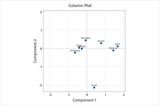
In this column plot, Eject and Rollover are most distant from the origin along the horizontal axis for component 1. This corresponds with the relatively high contribution (Contr) for these categories for component 1. Because Eject and No Eject, as well as Severe and NoSevere, are on opposite sides of the origin, component 1 contrasts these category values. Component 2 is shown on the vertical axis. The Small car size located far from the other categories on one side of the vertical axis. Therefore, component 2 contrasts Small car size with other categories.
Indicator table
The indicator table displays all the observations in your data in the form of indicator variables. Each indicator variable (column) represents one level of the categorical variable and each observation (row) takes a binary value depending on whether it does (1) or does not (0) belong to the category. Therefore, the values in all columns must be either 0 or 1.
To include the indicator table in your results, you must click Results and select the option to display the table when you perform the analysis.
| C1 | C2 | C3 | C4 | C5 | C6 | C7 | C8 | C8 |
|---|---|---|---|---|---|---|---|---|
| Male | Female | Normal Weight | Underweight | Overweight | Smokes | No Smokes | Activity | No Activity |
| 1 | 0 | 1 | 0 | 0 | 1 | 0 | 1 | 0 |
| 0 | 1 | 0 | 0 | 1 | 0 | 1 | 1 | 0 |
| 0 | 1 | 1 | 0 | 0 | 0 | 1 | 0 | 1 |
| 1 | 0 | 1 | 0 | 0 | 0 | 1 | 1 | 0 |
| 0 | 1 | 0 | 1 | 0 | 0 | 1 | 0 | 1 |
| 0 | 1 | 0 | 0 | 1 | 1 | 0 | 0 | 1 |
Burt table
The Burt table is a symmetric matrix used to help visualize and analyze relationships between categorical variables. To include the indicator table in your results, you must click Results and select the option to display the table when you perform the analysis.
| Male | Female | Slight | Medium | High | <20 | 20-50 | >50 | |
|---|---|---|---|---|---|---|---|---|
| Male | 87 | 0 | 33 | 45 | 9 | 26 | 47 | 14 |
| Female | 0 | 163 | 27 | 111 | 25 | 43 | 89 | 31 |
| Slight | 33 | 27 | 60 | 0 | 0 | 14 | 48 | 7 |
| Medium | 45 | 111 | 0 | 111 | 0 | 14 | 107 | 18 |
| High | 9 | 25 | 0 | 0 | 79 | 9 | 30 | 3 |
| <20 | 26 | 43 | 14 | 14 | 9 | 37 | 0 | 0 |
| 20-50 | 47 | 89 | 48 | 107 | 30 | 0 | 185 | 0 |
| >50 | 14 | 31 | 7 | 18 | 3 | 0 | 0 | 28 |
Each entry in the Burt table shows the number of observations that satisfy the categories in the corresponding row and column. For example, the entry in row 1 and column 3 is the number of observations that are both male and slightly active (33). The entry in row 1 and column 2 is the number of observations that are both male and female (0).
You can determine the total number of observations for each category in the diagonal entries from the upper left to the lower right, where each entry has the same column and row heading. For example, the entry in row 1 and column 1 shows the total number of Males (87), the entry in row 2 and column 2 shows the total number of Females (163), and so on.