In This Topic
Step 1: Use the EMP statistics to classify the measurement system
Use the EMP statistics to determine whether the measurement system is good enough to use for process improvement activities. The Classification Guidelines table gives the probabilities of warning for an X-bar chart to have an out-of-control point within ten subgroups for test 1 or for tests 1, 5, 6 and 8. First-class and second-class measurement systems are usually good enough to use for process improvement activities with an X-bar chart that uses test 1. Third-class measurement systems are usually good enough to use for process improvement activities with an X-bar chart that uses rules 1, 5, 6, and 8.
EMP Statistics
| Statistic | Value | Classification |
|---|---|---|
| Test-Retest Error | 0.1999 | |
| Degrees of Freedom | 78.0000 | |
| Probable Error | 0.1349 | |
| Intraclass Correlation (no bias) | 0.9645 | First Class |
| Intraclass Correlation (with bias) | 0.9224 | First Class |
| Bias Impact | 0.0421 |
Classification Guidelines
| Classification | Intraclass Correlation | Attenuation of Process Signals | Probability of Warning, Test 1* | Probability of Warning, Tests* |
|---|---|---|---|---|
| First Class | 0.80 - 1.00 | Less than 11% | 0.99 - 1.00 | 1.00 |
| Second Class | 0.50 - 0.80 | 11 - 29% | 0.88 - 0.99 | 1.00 |
| Third Class | 0.20 - 0.50 | 29 - 55% | 0.40 - 0.88 | 0.92 - 1.00 |
| Fourth Class | 0.00 - 0.20 | More than 55% | 0.03 - 0.40 | 0.08 - 0.92 |
Key result: Classification
In these results, the classification guidelines show that the measurement system is first class. The measurements contain a hundredths place, but the probable error is over one tenth. The results recommend that the measurements go to the tenths place instead of the hundredths place.
Step 2: Use the charts to identify improvement opportunities
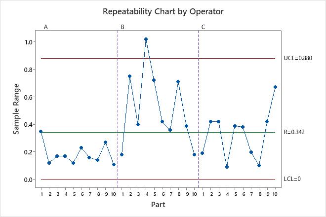
- Repeatability chart by operator
- Shows whether any points fall above the upper control limit.
If the operators measure consistently, the points will fall within the control limits.
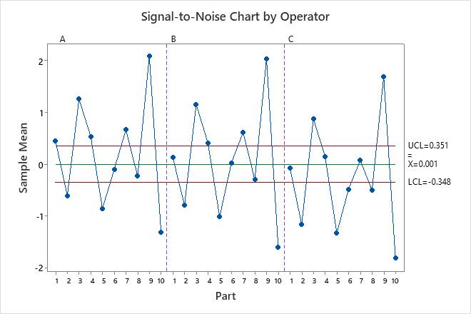
- Signal-to-noise chart by operator
- Shows whether most points fall beyond the control limits.
The parts that you choose for a gage study should represent the typical part-to-part variability. Thus, you should expect more variation between part averages, and the graph should show that most points fall beyond the control limits.
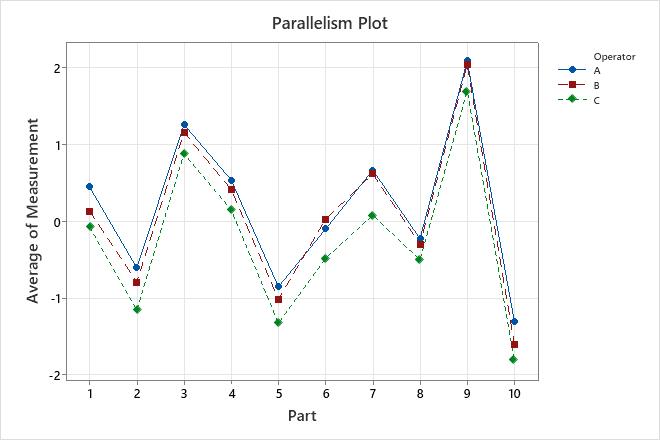
- Parallelism plot
- Shows whether the lines that connect the measurements from each operator are
similar or whether the lines cross each other.
Lines that are coincident indicate that the operators measure similarly. Lines that are not parallel or that cross indicate that an operator's ability to measure a part consistently depends on which part is being measured. A line that is consistently higher or lower than the others indicates that an operator adds bias to the measurement by consistently measuring high or low.
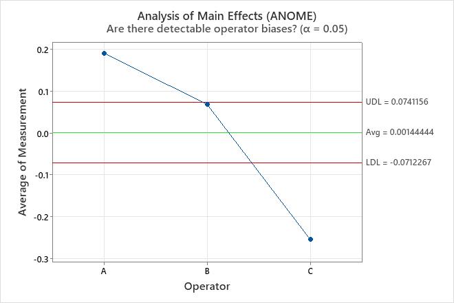
- Analysis of main effects (ANOME)
- Shows whether differences between operators are small compared to the
differences between parts.
Points within the decision limits indicate that the mean measurements for each operator are similar.
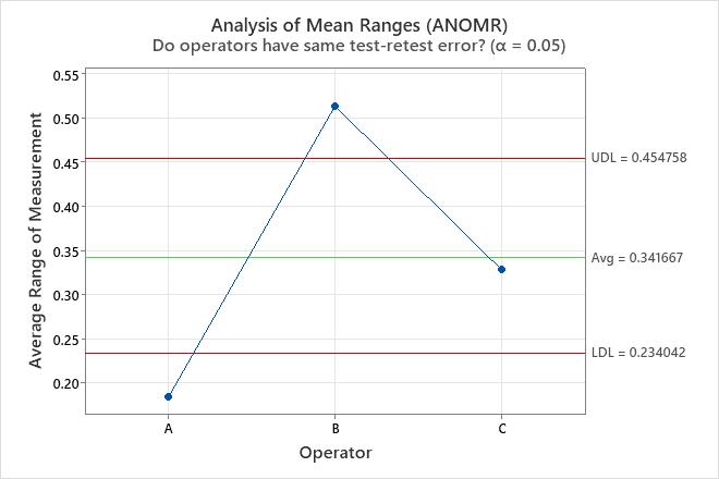
- Analysis of mean ranges (ANOMR)
- Shows whether operators measure consistently compared to each
other.
Points within the decision limits indicate that the mean ranges for each operator are similar.
Key results: Charts
On the repeatability chart, the sample range for part 4 by operator B exceeds the upper control limit. To identify an opportunity to improve the measurement system, investigate this sample for any special causes that explain the large range.
On the signal-to-noise chart, at least 7 points are out-of-control for each operator. The ability of the measurement system to distinguish parts seems sufficient.
On the parallelism plot, the measurements for operator A are consistently greater than the measurements for the other operators and the measurements for operator C are consistently less than the others. Use the decision limits on the ANOME chart to verify that these differences are large enough for the measurement system to distinguish.
On the ANOME chart, the point for operator A is above the upper decision limit and the point for operator C is below the lower decision limit. The measurement system indicates that the measurements for operator A have a higher mean and the measurements for operator C have a lower mean. To improve the measurement system, reduce the differences among operators.
On the ANOMR chart, the point for operator B is above the upper decision limit. This result is consistent with the out-of-control point for operator B on the repeatability chart.