In This Topic
Step 1: Determine whether the process variability is in control
The generalized variance chart plots the joint process variability of several related variables. The center line is the determinant of the sample covariance matrix. The lower and upper control limits are based on the number of variables and number of observations in each subgroup.
Red points indicate subgroups that are above the upper control limit and not in control. One disadvantage to multivariate charts is that the scale is unrelated to the scale of any of the variables, and out-of-control signals do not reveal which variable (or combination of variables) caused the signal.
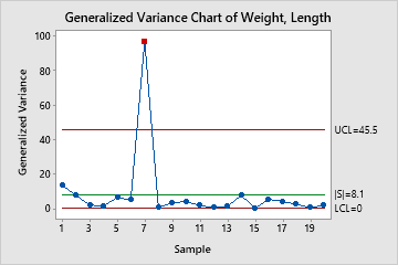
In these results, one point is above the upper control limit. The joint variability of weight and length is out of control.
When you hold the pointer over a red point, you can get more information about this subgroup.
Step 2: Identify which points failed the test
Investigate any subgroups that are above the upper control limit. The output show which points are above the upper control limit, as shown here.
Test Results for Generalized Variance Chart of Weight, Length
| TEST. One point beyond control limits. |
|---|
| Test Failed at points: 7 |