In This Topic
Step 1: Examine the R chart to determine whether the process variation is in control
Before you interpret the Acceptance Xbar chart, examine the R chart to determine whether the process variation is in control. If the R chart is not in control, then the estimate of process variation and the acceptance control limits on the Acceptance Xbar chart might not be reliable.
The R chart plots the subgroup ranges. If the subgroup size is constant, then the center line on the R chart is the average of the subgroup ranges. If the subgroup sizes differ, then the value of the center line depends on the subgroup size, because larger subgroups tend to have larger ranges. The control limits on the R chart, which are set at a distance of 3 standard deviations above and below the center line, show the amount of variation that is expected in the subgroup ranges.
Red points indicate subgroups that fail at least one of the tests for special causes and are not in control. If the same point fails multiple tests, then the point is labeled with the lowest test number to avoid cluttering the graph. If the chart shows out-of-control points, investigate those points.
Out-of-control points can influence the estimates of process parameters and prevent control limits from truly representing your process. If out-of-control points are due to special causes, then consider omitting these points from the calculations. For more information, go to Specify how to estimate the parameters for Acceptance Xbar-R Chart.
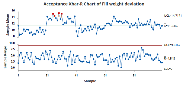
The R chart does not show evidence of unusual variation, so the engineer can interpret the Acceptance Xbar chart.
Step 2: Examine the Acceptance Xbar chart to determine whether shifts in the process mean are acceptable
The Acceptance Xbar chart plots the average of the measurements within each subgroup. The center line is the average of all subgroup averages. The acceptance control limits are based on the specification limits, the accepted percentage outside each specification limit, the probability of intervention, the subgroup size, and the estimated process variation. The chart displays a lower acceptance control limit, an upper acceptance control limit, or both, depending on which specification limits you enter.
Red points indicate subgroup means that are outside an acceptance control limit. A point outside an acceptance control limit indicates that the process mean shifted far enough toward the corresponding specification limit that the accepted percentage of process output outside the specification limit might be exceeded.
Shifts in the process mean that remain within the acceptance control limits do not indicate that the accepted percentage is exceeded. If the chart shows an out-of-control point, investigate whether the shift reflects an additional cause or a stronger effect from an existing cause.
Out-of-control points can influence the estimates of process parameters and prevent control limits from truly representing your process. If out-of-control points are due to special causes, then consider omitting these points from the calculations. For more information, go to Specify how to estimate the parameters for Xbar-R Chart.
Three subgroup means are above the upper acceptance control limit. These points indicate that the process mean shifted far enough toward the upper specification limit that more than 1% of the process output might exceed the specification limit.
After sample 40, the process mean shifts downward, and the subgroup means remain within the upper acceptance control limit. The engineer should investigate the three out-of-control subgroups to determine whether the shift reflects an additional cause or a stronger effect from an existing cause. Possible causes include a machine adjustment, a change in raw material, an operator change, or a different production lot.
Step 3: Identify which points failed each test
Investigate any subgroups that fail a test. On the Acceptance Xbar chart, Test 1 identifies subgroup means that are outside the acceptance control limits. On the R chart, Tests 1 through 4 detect special causes in the process variation.
If a point on the R chart fails more than one test, the graph displays only one test number. The test results in the output identify all the tests that each point failed.
Test Results for Xbar Chart of Fill weight deviation
| TEST 1. One point outside of acceptance control limits. |
|---|
| Test Failed at points: 25, 26, 29, 31 |
Note
When you use several tests on the R chart at the same time, the sensitivity of the chart increases. However, the false alarm rate also increases, which can make you react to the test results unnecessarily.
For more information about the tests for special causes on the R chart and when to use them, go to Using tests for special causes in control charts.
