Interpretation
Use the capability histogram to view your sample data in relation to the specification limits.
- Examine the sample data in relation to the specification limits
-
Visually examine the data in the histogram in relation to the lower and upper specification limits. Ideally, the spread of the data is narrower than the specification spread, and all the data are inside the specification limits. Data that are outside the specification limits represent nonconforming items.
Note
To determine the actual number of nonconforming items in your process, use the results for PPM < LSL, PPM > USL, and PPM Total. For more information, go to Observed performance for Nonparametric Capability Analysis.
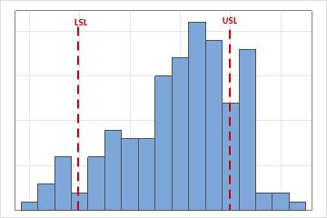
In these results, the process spread is larger than the specification spread, which suggests poor capability. Although much of the data are within the specification limits, many nonconforming items are below the lower specification limit (LSL) and above the upper specification limit (USL).
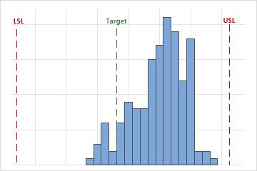
- Assess the location of the process
-
Evaluate whether the process is centered between the specification limits or at the target value, if you have one. The peak of the distribution curve shows where most of the data are located.
In these results, although the sample observations fall inside the specification limits, the peak of the distribution curve is not on the target. Most of the data exceed the target value and are located near the upper specification limit.