For information about data considerations, examples, and interpretation, go to Overview for Wafer Plot.
Y coordinates
Enter a numeric column with data that represents the y-axis on the wafer plot.
X coordinates
Enter a numeric column with data that represents the x-axis on the wafer plot.
Response variable
Enter a numeric column that defines the color gradient of the rectangles in the wafer plot.
Function
From Function, select the function of the Response variable. For example, if you select Maximum, Minitab defines the color gradient for the wafer plot based on the maximum value of the response variable in each rectangle.
- Percentile
- If you select Percentile, you must enter a value in Percentile value. The value must be between 0 and 100. Minitab uses the value you enter to define the color gradient in the wafer plot. For example, if you enter 50, Minitab uses the 50th percentile to define the color gradient for each rectangle of the wafer plot.
- Percent between two values
- If you select Percent between two values, you must enter numeric values in First value and Second value. The value you enter for First value must be less than or equal to the value you enter for Second value. Minitab defines the color gradient for the wafer plot based on the percentage of observations that is between the two values.
- Percent equal to specified values
- If you select Percent equal to specified values, you must enter one or more values in Values. The values must be the same type of data as the column you entered in Response variable. Minitab defines the color gradient for the wafer plot based on the percentage of observations that is equal to the values that you enter.
By variable
Enter a grouping variable in By variable to create a separate wafer plot for each level of the grouping variable. The column that you enter must be the same length as the columns in X coordinates and Y coordinates.
Layout
- In separate graphs
- Creates a separate plot for each level of the By variable.
- In separate panels of one graph
- Divides the plot into separate panels and displays a plot for each level of the By variable on a panel.
Gradient Type
- Diverging
- Rectangles with high values are red, and rectangles with low values are blue. In Gradient symmetric around value, enter a value to center the gradient scale at a specific value rather than the center of the function that you selected. For example, a business owner selects the gradient to be defined by the mean of the profit of multiple products across multiple stores. The owner enters 0 as the Gradient symmetric around value so that rectangles with products that made a profit are a different color than those that lost money.
-

- Sequential from low to high
- Rectangles with high values are dark blue, and rectangles with low
values are light blue and light gray. You can use this option to highlight
rectangles with more productivity or to maximize revenue.

- Sequential from high to low
- Rectangles with low values are dark blue, and rectangles with high
values are light blue and light gray. You can use this option to highlight
rectangles with low defect rates or to minimize cost.

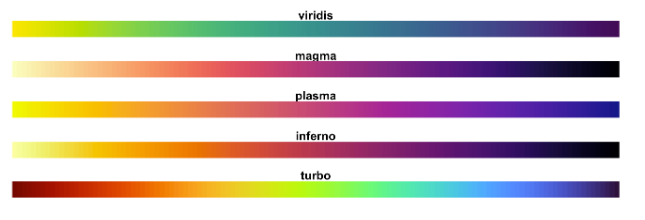
- Different color gradients
- You can choose from 5 alternate color gradients.
Gradient Range
Note
If you specified Percent between two values or Percent equal to specified values for the function, the wafer plot uses a percentage scale for the gradient. In these cases, the value that you enter for Minimum and Maximum should be between 0 and 1.