For information about data considerations, examples, and interpretation, go to Overview for Variability Chart.
Response variables
Enter one or more numeric columns that contain the measurement data.
Factors
Enter the columns that contain the levels for the factors. The first variable is the outermost on the scale and the last variable is the innermost. You can have up to 8 factors.
By variables
- Show all combinations
-
When you enter multiple By variables, Minitab enables the Show all combinations checkbox. Select this option to create a separate plot for each combination of groups created by the By variables. If you do not select this option, Minitab creates a plot for each group of each By variable.
For example, the first By variable has 2 groups, Male and Female, and the second By variable has 2 groups, Employed and Unemployed. If you select Show all combinations, Minitab creates 4 separate plots for the combinations of Male/Employed, Male/Unemployed, Female/Employed, and Female/Unemployed. If you do not select Show all combinations, Minitab creates 4 separate plots for Male, Female, Employed, and Unemployed.
Data Representation
Select any of the following options.
- Individual data points
- Plot individual data points on the average response with variation chart.
- Range per cell
- Display every range bar that connects the minimum and maximum data points for each combination of factor levels.
- Connecting lines of cell means
- Add a line that connects the means for the factor level combinations.
- Overall mean
- Display a horizontal line at the overall mean on the average response with variation chart.
- Means for factor
- Display a horizontal line at the means for the factor on the average response with variation chart.
Scale
Specify a log transformation and whether you want Minitab to display the same Y-scale for multiple charts.
- Log transformation: Y-scale
-
A logarithmic scale linearizes logarithmic relationships by changing the axis, so that the same distance represents different changes in value across the scale. For example, in the scatterplot with the untransformed Y-scale, the function is not linear. When you transform the Y-scale to logarithm base e, the form of the data is linear.
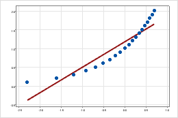
Untransformed Y-scale
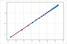
Transformed Y-scale (log base 10 transformation)
- Same scale
- Use the same Y-scale across all graphs.