About calculated lines
The following examples show reference lines that examine the trend on a scatterplot and the shape of the data on a histogram.
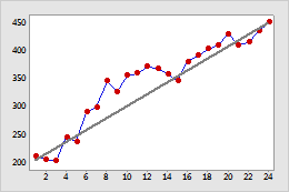
Target sales
This time series plot displays actual sales data (the line that connects the symbols) with a calculated line that represents target sales (the straight line). This graph shows that usually actual sales surpassed target sales. However, you might want to examine the instances where sales did not meet the target to determine the cause.
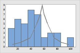
Theoretical distribution of failure times
This graph shows that the actual engine failure times (the histogram) aren't a very good fit with the theoretical distribution (the solid line).
Add a calculated line to a graph
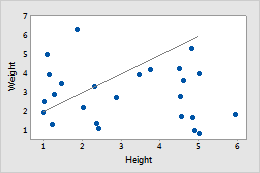
For example, you create a scatterplot and you want to add a line drawn with specific coordinates. The calculated line coordinates are (1,2) and (5,6).
| C1 | C2 | C3 | C4 |
|---|---|---|---|
| Weight | Height | X | Y |
| 3.97 | 3.46 | 1 | 2 |
| 2.5 | 1.01 | 5 | 6 |
| 4.2 | 3.73 | ||
| 2.19 | 2.02 | ||
| ... | ... |
Example worksheet
Example graph
Follow these steps to enter coordinates for a calculated line and then add the calculated line to a graph.
-
To enter the coordinates for a calculated line:
- Name one empty column X and one empty column Y.
-
In the X column, enter
the X coordinates.
For example, enter 1 and 5.
-
In the Y column, enter
the Y coordinates.
For example, enter 2 and 6.
- Create the scatterplot.
- Double-click the scatterplot.
- Right-click the scatterplot and choose .
- In Y column, enter Y.
- In X column, enter X.
- Click OK.
Note
Calculated lines do not update when you change the coordinates. You must add a new calculated line with the updated coordinates.
Edit a calculated line
You can edit the color, size, line type, arrow style, and coordinate system for a calculated line.
- Double-click the graph.
-
Double-click the calculated line.
- Attributes:
Change the line type, color, size, and arrow style of the calculated line. On
the following histogram, the calculated line has a custom color and line type.
- Units: Minitab tracks the location of calculated lines using a coordinate system. The coordinates can be in data units, which are relative to the graph scales, or figure units, which are relative to the figure region. (Usually, the figure region covers the entire graph.) Because calculated lines are defined by data units, normally, you would not change to figure units. To change the units, double-click the calculated line. On the Units tab, select Switch coordinate system from data units to figure units.
- Attributes:
Change the line type, color, size, and arrow style of the calculated line. On
the following histogram, the calculated line has a custom color and line type.