Use a 3D scatterplot to see how a response variable relates to two predictor variables. A 3D scatterplot is a three-dimensional graph that is useful for investigating desirable response values and operating conditions.
- Predictor values on the x- and y-axes.
- Response values on the z-axis.
- Data points that tend to rise together suggest a positive correlation.
- Data points that tend to rise as other data points tend to decline suggests a negative correlation.
- Outliers fall far from the main group of data points.
Tip
Adding project lines helps you visualize each point's position in three-dimensional space. For more information, go to Project lines. Rotate the graph to view the plot from different angles and explore possible relationships in the data. For more information, go to Select display options for 3D Scatterplot and 3D Surface Plot.
Key Results: 3D Scatterplot
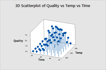
This 3D scatterplot shows the relationship between the time and temperature settings used to cook a frozen dinner and the quality score assigned by food testers. Heating the dinner at shorter time intervals results in under-cooked product and low quality scores. However, heating at the longest intervals combined with the highest temperatures also results in low scores because the food becomes over-cooked. The optimal settings appear to be between 400° and 450° and between approximately 30 and 36 minutes.