In This Topic
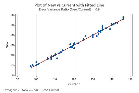
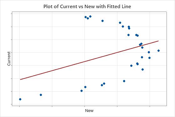
Plot with Fitted Line
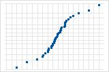
The plot with the fitted line shows the response and the predictor data. The plot includes the orthogonal regression line, which represents the orthogonal regression equation.
You can also choose to display the least squares fitted line on the plot for comparison. Larger differences between the two lines show how much the results depend on whether you account for uncertainty in the values of the predictor variable. The least squares values equal the predicted values for the orthogonal regression, so that you can also use the least squares line to examine the predicted values.
Interpretation
- The sample contains an adequate number of observations throughout the entire range of all predictor values.
- The sample contains no curvature that the model does not fit.
- The sample contains no outliers, which can have a strong effect on the results. Try to identify the cause of any outliers. Correct any data entry or discernible measurement errors. Consider removing data values that are associated with abnormal, one-time events (special causes). Then, repeat the analysis.
You often use orthogonal regression in clinical chemistry or a laboratory to determine whether two instruments or methods provide comparable measurements.
This plot shows an example of measurements from two instruments or methods that are comparable. The points follow the fitted line with minimal scatter and without any pattern that reveals systematic differences between the methods.
In the results below, the confidence intervals for the coefficients do not provide evidence that the measurements of the two instruments differ. However, the plot shows that points do not fall close to the line, which indicates that the measurements from the two instruments are not comparable. Because the data do not fit the equation, the usual conclusion is that the instruments differ.
Coefficients
| Predictor | Coef | SE Coef | Z | P | Approx 95% CI |
|---|---|---|---|---|---|
| Constant | -0.00000 | 0.215424 | -0.0000 | 1.000 | (-0.422224, 0.42222) |
| New | 1.00000 | 0.517586 | 1.9320 | 0.053 | (-0.014450, 2.01445) |
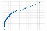
Histogram of residuals
The histogram of the residuals shows the distribution of the residuals for all observations.
Interpretation
| Pattern | What the pattern may indicate |
|---|---|
| A long tail in one direction | Skewness |
| A bar that is far away from the other bars | An outlier |
You often use orthogonal regression in clinical chemistry or a laboratory to determine whether two instruments or methods measure the same thing. When the model does not meet the assumptions, one explanation is that the methods do not measure the same thing.
Because the appearance of a histogram depends on the number of intervals used to group the data, don't use a histogram to assess the normality of the residuals. Instead, use a normal probability plot.
A histogram is most effective when you have approximately 20 or more data points. If the sample is too small, then each bar on the histogram does not contain enough data points to reliably show skewness or outliers.
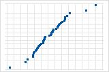
Normal probability plot of residuals
The normal probability plot of the residuals displays the residuals versus their expected values when the distribution is normal.
Interpretation
Use the normal probability plot of the residuals to verify the assumption that the residuals are normally distributed. The normal probability plot of the residuals should approximately follow a straight line.
S-curve implies a distribution with long tails.

Inverted S-curve implies a distribution with short tails.
Downward curve implies a right-skewed distribution.
A few points lying away from the line implies a distribution with outliers.
You often use orthogonal regression in clinical chemistry or a laboratory to determine whether two instruments or methods measure the same thing. If you see a nonnormal pattern, one explanation is that the methods do not measure the same thing. Also examine the other residual plots for other problems with the model, such as a time-order effect. If the residuals do not follow a normal distribution, the confidence intervals and p-values can be inaccurate.
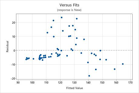
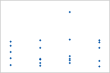
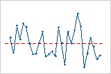
Residuals versus fits
The residuals versus fits graph plots the residuals on the y-axis and the fitted values for the predictor on the x-axis.
You often use orthogonal regression in clinical chemistry or a laboratory to determine whether two instruments or methods measure the same thing. When the model does not meet the assumptions, one explanation is that the methods do not measure the same thing.
Interpretation
Use the residuals versus fits plot to verify the assumption that the residuals are randomly distributed and have constant variance. Ideally, the points should fall randomly on both sides of 0, with no recognizable patterns in the points.
| Pattern | What the pattern may indicate |
|---|---|
| Fanning or uneven spreading of residuals across fitted values | Nonconstant variance |
| Curvilinear | A missing higher-order term |
| A point that is far away from zero | An outlier |
| A point that is far away from the other points in the x-direction | An influential point |
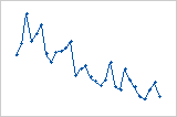
Plot with outlier
One of the points is much larger than all of the other points. Therefore, the point is an outlier. If there are too many outliers, the model may not be acceptable. You should try to identify the cause of any outlier. Correct any data entry or measurement errors. Consider removing data values that are associated with abnormal, one-time events (special causes). Then, repeat the analysis.
Plot with nonconstant variance
The variance of the residuals increases with the fitted values. Notice that, as the value of the fits increases, the scatter among the residuals widens. This pattern indicates that the variances of the residuals are unequal (nonconstant).
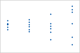
Residuals versus order
The residuals versus order plot displays the residuals in the order that the data were collected.
Interpretation
Trend
Shift
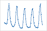
Cycle
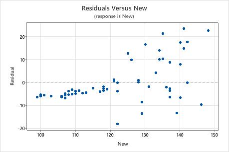
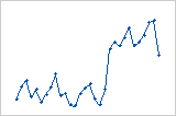
Residuals versus the variables
The residuals versus variables plot displays the residuals versus another variable. The variable could already be included in your model. Or, the variable may not be in the model, but you suspect it affects the response.
Interpretation
You often use orthogonal regression in clinical chemistry or a laboratory to determine whether two instruments or methods measure the same thing. Patterns in a residual plot against the response variable or the predictor variable can clarify how one method is different from another.
In these results, the residuals versus fits plot shows a pattern where all of the high residuals are in the middle of the plot. A plot of the residuals versus the response variable clarifies that as the readings for the new method get larger, agreement with the other method gets worse.