An engineer wants to assess the relationship between sintering time and the compressive strength of three different metals. The engineer measures the compressive strength of five specimens of each metal type at each sintering time: 100 minutes, 150 minutes, and 200 minutes.
The engineer performs a general linear model (GLM) ANOVA, and includes a main effects plot in the output.
- Open the sample data, SinteringTime.MWX.
- Choose .
- In Responses, enter Strength.
- In Factors, enter SinterTime and MetalType.
- Click OK.
Interpret the results
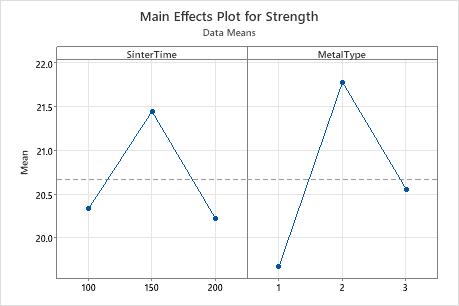
In this example, the main effects plot shows that metal type 2 is associated with the highest strength and that a sinter time of 150 is associated with the highest strength. However, the GLM results indicate that the main effect for sinter time is not statistically significant. The differences between the mean strength for the levels of sinter time may be due to random chance.
If you use Fit General Linear Model with this data set, the results indicate that the interaction between SinterTime and MetalType is statistically significant. This interaction effect indicates that the relationship between metal type and strength depends on the value of sinter time. Consequently, the engineer cannot interpret the main effects without considering the interaction effects.
Although you can use this plot to display the effects, you must also evaluate statistical significance by looking at the effects in an analysis of variance table.
This plot displays data means. While you can use the data means to obtain a general idea of which effects may be evident, it is generally good practice to use the fitted means in Factorial Plots to obtain more accurate results.