Plotted points
The plotted points are the cumulative scores based on zones at 1, 2, and 3 standard deviations from the center line.
Interpretation
The cumulative score is a sum of the weights of the plotted points. Each time the points cross the center line, the cumulative score is reset to zero. Each cumulative score helps to determine whether the process is in control. When the cumulative score is greater than or equal to 8, the process is out of control.
Zone score
- Zone 1 is between the center line and 1σ and has a weight of 0
- Zone 2 is between 1σ and 2σ and has a weight of 2
- Zone 3 is between 2σ and 3σ and has a weight of 4
- Zone 4 is beyond 3σ and has a weight of 8
Interpretation
The cumulative score is a sum of the weights of the plotted points. Each time the points cross the center line, the cumulative score is reset to zero. Each cumulative score helps to determine whether the process is in control. When the cumulative score is greater than or equal to 8, the process is out of control.
Center line
The center line on a zone chart is the overall average of the individual observations or subgroup averages.
Interpretation
Use the center line to observe how the process performs compared to the average.
CAUTION
Do not confuse the center line with the target value for your process. The target is your desired outcome. The center line is the actual outcome.
Standard deviation
The standard deviation measures the overall variability in the data. Minitab does not display the standard deviation on the chart, but uses it to calculate the center line and the control limits. To store the standard deviation in the worksheet, select it on the Storage tab of the Options dialog box.
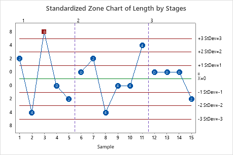
Stages
Use stages to create a historical control chart that shows how a process changes over specific periods of time. For more information, go to Add stages to show how a process changed.
Interpretation
For example, the following zone chart includes three stages.