Complete the following steps to specify the data for your graph.
- In Z variables, enter one or more columns that you want to explain or predict. The Z variable is the response of interest. By default, Minitab creates a separate graph for each Z variable.
- In Y variable, enter the column of y-values. The Y variable is an explanatory variable used to predict the response (Z).
- In X variable, enter the column of x-values. The X variable is an explanatory variable used to predict the response (Z).
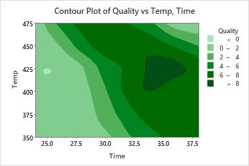
In this worksheet, Quality is the Z variable, Temp is the Y variable, and Time is the X variable. The graph shows the relationship between quality, temperature, and time.
| C1 | C2 | C3 |
|---|---|---|
| Temp | Time | Quality |
| 350 | 24 | 0.1 |
| 350 | 26 | 0.2 |
| 350 | 28 | 1.1 |
| ... | ... | ... |