A quality engineer at a canning company assesses whether the can-filling process is in control. Each hour, the engineer collects a subgroup of 10 cans. To minimize the within-subgroup (can-to-can) variation, the engineer collects the cans for a given subgroup in a short period of time.
The quality engineer creates an Xbar-S chart to monitor the weight of the cans.
- Open the sample data, CanWeight.MWX.
- Choose .
- From the drop-down list, select All observations for a chart are in one column, enter Weight.
- In Subgroup sizes, enter Subgroup ID.
- Click Xbar-S Options.
- On the Tests tab, select 1 point > K standard deviations from center line (Test 1), K points in a row on same side of center line (Test 2), and K points in a row within 1 standard deviation of center line (either side) (Test 7).If you are not sure which tests apply in your specific situation, use Tests 1, 2, and 7 when you first establish the control limits based on your data. After the control limits are established, you can use the known values of those limits and Test 7 is no longer needed.
- Click OK in each dialog box.
Interpret the results
Interpret the S chart first. None of the points are outside the control limits, and the points display a random pattern. Thus, the process variation is in control and the engineer can examine the process center on the Xbar chart.
One points fails test 1 (one point more than 3 standard deviations from center line) on Xbar chart.
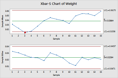
Test Results for Xbar Chart of Weight
| TEST 1. One point more than 3.00 standard deviations from center line. |
|---|
| Test Failed at points: 3 |