Matrix of plots: Simple
Create a matrix plot that displays a scatterplot for each combination of variables. For example, the following matrix plot shows the relationship between each possible combination of the variables Rate of Return, Sales and Years.
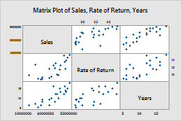
For more information, go to Create a simple matrix of plots.
Matrix of plots: With Groups
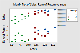
Create a matrix plot that displays a scatterplot for each combination of variables, divided into groups. Groups are represented by different colors and symbols. For example, the following matrix plot shows the relationships between each possible combination of the variables Rate of Return, Sales and Years, divided into three groups.
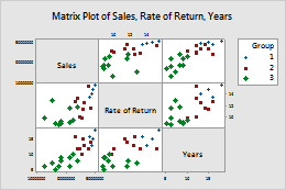
For more information, go to Create a matrix of plots with groups.
Matrix of plots: With Smoother
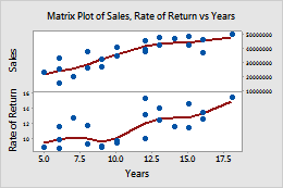
Create a matrix plot that displays a scatterplot for each combination of variables, with smoother lines that help you visualize the relationships. For example, the following matrix plot shows the relationship between each possible combination of the variables Rate of Return, Sales and Years, with smoother lines.
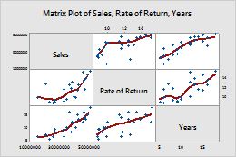
For more information, go to Create a matrix of plots with smoother lines.
Each Y versus each X: Simple
Create a matrix plot that displays a scatterplot for each combination of x and y variables. For example, the following matrix plot shows the relationships between the y variables Rate of Return and Sales, and the x variable Years.
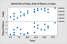
For more information, go to Create a simple matrix plot of each Y versus each X.
Each Y versus each X: With Groups
Create a matrix plot that displays a scatterplot for each combination of x and y variables, divided into groups. Groups are represented by different colors and symbols. For example, the following matrix plot shows the relationships between the y variables Rate of Return and Sales, and the x variable Years, divided into three groups.
For more information, go to Create a matrix plot of each Y versus each X with groups.
Each Y versus each X: With Smoother
Create a matrix plot that displays a scatterplot for each combination of x and y variables, with smoother lines that help you visualize the relationships. For example, the following matrix plot shows the relationships between the y variables Rate of Return and Sales, and the x variable Years, with smoother lines.
For more information, go to Create a matrix plot of each Y versus each X with smoother line.