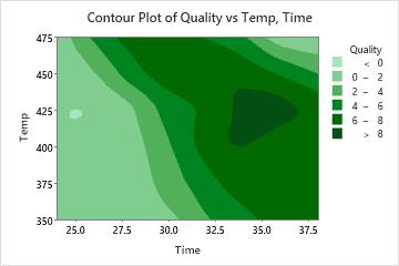
A food scientist wants to determine the optimal time and temperature for heating a frozen dinner. The scientist prepares 14 samples at various times and temperatures, and then has professional food tasters rate each sample for overall quality. The scientist creates a contour plot to examine the results.
- Open the sample data, FrozenDinnerPrep.MWX.
- Choose .
- In Z variables, enter Quality.
- In Y variable, enter Temp.
- In X variable, enter Time.
- Click OK.
Interpret the results
In this graph, darker regions indicate higher z-values. These higher z-values seem to form a ridge running from the upper left of the graph to the middle right. The valleys in the lower part of the graph and the upper right represent time-temperature combinations that result in under-cooked or over-cooked entrees, respectively.