About mesh
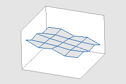
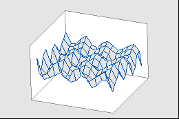
Usually, the mesh is not displayed on a graph. The following graphs illustrate what the mesh might look like.
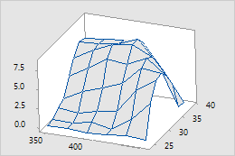
3D wireframe and surface plots
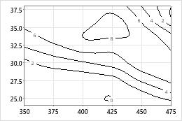
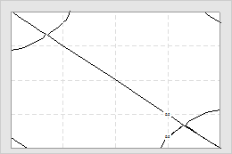
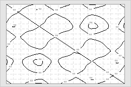
Contour plot
Tip
Choose to create a regular grid of x-y sample locations or factor combinations. You can then add your own z columns or choose from a list of functions.
How does Minitab plot response data on the mesh?
Minitab plots response (z) values at the x-y intersections of an evenly-spaced mesh. If your x- and y-values are evenly spaced, Minitab plots the z-values at the x-y intersections. If your x- and y-values are not evenly spaced, Minitab interpolates (estimates) the z-values at the intersections of a regular 15 by 15 mesh with the same x- and y-ranges as your data.
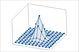
Data on a regular mesh
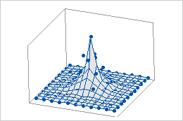
Data on an irregular mesh
The symbols on these graphs represent the actual, not interpolated, data points. With a regular mesh the z-values are plotted at the x-y intersections. When the x- and y-values do not form a regular mesh, the z-values are not plotted at the intersections.
Note
Symbols and project lines always display the actual, not the interpolated, data points.
Change the interpolation method for an irregular mesh
If your x- and y-values are not evenly spaced, Minitab interpolates (estimates) the z-values at the intersections of a regular 15 by 15 mesh with the same x- and y-ranges as your data. You can change the interpolation method that Minitab uses. If you are unsure of which method to use, you may want to try both and pick the one that works best for your data.
Note
If your x- and y-values form an evenly-spaced grid, the interpolation method has no effect on your plot.
- In the dialog box for the graph you are creating, click Surface Options or Contour Options.
-
On the
Method
tab, choose an interpolation method.
- Distance method
- The Distance method (default) works well in a wide range of circumstances. It is conservative in that it will always give estimates of z within the range of your data.
- Akima’s polynomial method
- This method works well in some cases, but can have undesired effects in others. Because it uses a fifth-order polynomial, it can estimate z-values at x-y positions beyond those you have sampled that are too large or small.
Use the Distance method if the following are true Use Akima's polynomial method if the following are true Your surface has isolated extreme values or sudden transitions Your surface smoothly changes over the x- and y-range of your data Sampling is not intensive enough to capture smooth surface transitions Sampling is intensive enough to catch smooth surface transitions Sampling error is large Sampling error is small relative to the surface - Click OK.
-
(Optional) Show the locations of your x- and y-data by adding symbols
to the plot.
- Double-click the graph.
- Right-click the graph and choose .
- Choose Symbols, then click OK.
Tip
Show the locations of your x- and y-data for the following reasons:
- If you use Akima's polynomial method, showing symbols can help you look for steep changes just outside the x- and y-data that may not be supported if you had sampled in that area.
- If you use the Distance method, showing the symbols can help you choose a distance power because you can see how predictions extend beyond your x- and y-data.
What is the mesh resolution?
The number of x- and y-values on a mesh determines its resolution. A higher resolution mesh (one with more x- and y-values) will result in a finer interpolation of the surface or contours. The following wireframe and contour plots show the same data but use different mesh resolutions. (Gridlines on the contour plots show approximate mesh location.)
5 by 5 mesh with wireframe plots
15 by 15 mesh with wireframe plots
5 by 5 mesh with contour plots
15 by 15 mesh with contour plots
Adjust the mesh resolution
When x-y data do not form a regular grid, the mesh resolution could have a large effect on a contour or surface plot. If your data were sampled such that your x-y points are close to a regular grid, you might enhance the fit by specifying a mesh similar to that of your data.
For example, you want to investigate the effect of temperature and pressure on cook time. You have four temperature settings (325, 350, 375, 400) and three pressure settings (5, 10, 15). When you run the experiment, however, the temperature was slightly different than the desired setting for several runs; thus, the data won't quite form a regular grid. However, because your temperature values are close to regular, a 4 x 3 mesh (temperature x pressure) might give good results for your contour and 3D surface plots.
Note
Using a mesh with more and smaller intervals than exist between data points may seem to add more resolution to the graph, but the detail is probably only background noise.
- Double-click the surface.
- Double-click the 3D surface plot or contour plot
-
On the
Method
tab, do the following:
- Under Mesh for Interpolating Surface, choose Custom.
- Enter X-Mesh Number and Y-Mesh Number for the resolution of mesh you want.