A scientist for a company that manufactures processed food wants to assess the percentage of fat in the company's bottled sauce. The advertised percentage is 15%. The scientist measures the percentage of fat in 20 random samples.
As part of the initial investigation, the scientist creates a probability plot to check for normality and to evaluate the distribution.
- Open the sample data, FatContent.MWX.
- Choose .
- In Graph variables, enter 'Percent Fat'.
- Click OK.
Interpret the results
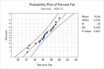
The data points are relatively close to the fitted normal distribution line (the middle solid line of the graph). The p-value is greater than the significance level of 0.05. Therefore, the scientist fails to reject the null hypothesis that the data follow a normal distribution.
If you hold your pointer over the fitted distribution line of the graph in Minitab, a tooltip shows a table of percentiles and values. For the percent fat data, the tooltip indicates that 15% fat is at approximately the 30th percentile. Therefore, approximately 30% of the sauce has at least 15% fat or less, and 70% of the sauce has more than 15% fat.
Note
For information on how to specify different distributions and parameters, go to Fitted distribution lines.