The Options tab displays the graph settings that you can change. For any graph that has an option,
the effects are the same.
- Legend
- Choose the placement of the legend. By default, Minitab Connect places it at the bottom of your graph. You can move it to the top, left, or right. You can also choose to remove the legend.
- Split Axis
- Split the y-axis to create a separate scale for each metric and stack them on top of each
other. By default, Minitab Connect overlays the graphs on the same plot and places the different scales side by
side on the left and right side. This option is most common for spline and line
charts.
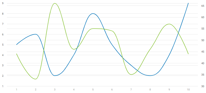
No Split Axis
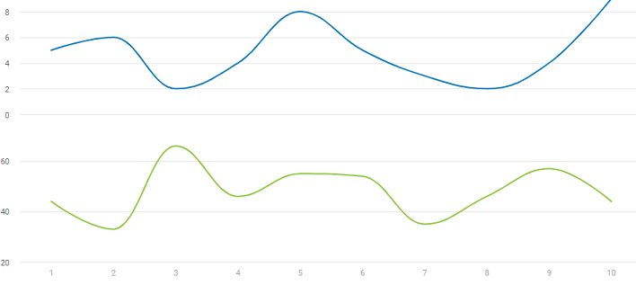
Split Axis
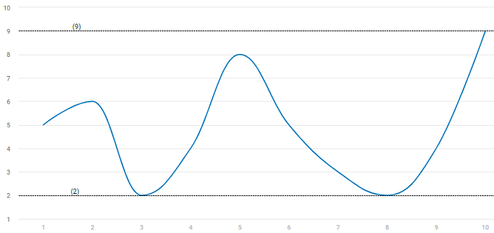
- Show Min / Max
- Displays a line at the minimum and maximum value for each metric.
- Limit
- Choose the number of records to use for the graph. A positive number limits the number of records, and a negative number removes the number of records. For example, you could enter 10 to view the top 10 entries, or enter -10 to remove the last 10 observations.
- Color
- Change the color of the lines, points, and bars on the graph. Select the color to change it.
Select the add color button
 to add colors.
Select the Delete button
to add colors.
Select the Delete button  to remove a color.