The Fields tab displays the different graphs you can create with Minitab Connect. For help on the options you can change for a spline chart, go to Options tab.
From the first dropdown menu, choose from the current configuration of the table you have open, or you can select a saved configuration of the table. If you choose Current Config, any graphs you create can change if the configuration of the table changes in the Prep tool. If you don't want your graph to update with changes to the table, use the Prep tool to save a view of the current table, and select that view before you make the graph.
In Type, choose the graph that you want to create. See below for the types of graphs you can create in Minitab Connect.
In This Topic
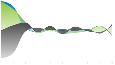
Spline and Area Spline
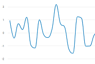
Spline
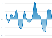
Area Spline
- Metric(s)
- Enter the variable to display on the y-axis.
- Dimension(s)
- Enter the variable to display on the x-axis. For a spline chart, the x-axis is often a date/time field. Minitab Connect expects date formats with the day, month and year. If you import data with incomplete information (for example, no year), the data imports as a text field and may not display correctly in a visualization.
- Breakdown(s)
- Enter a grouping variable. The points for each group are graphed with different colors.
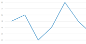
Line
Creates points based on values for two variables and connects those points with a line. Use a line plot to compare the response patterns of a series.
- Metric(s)
- Enter the variable to display on the y-axis.
- Dimension(s)
- Enter the variable to display on the x-axis. For a line chart, the x-axis is often a date/time field. Minitab Connect expects date formats with the day, month and year. If you import data with incomplete information (for example, no year), the data imports as a text field and may not display correctly in a visualization.
- Breakdown(s)
- Enter a grouping variable. The lines for each group are graphed with different colors.
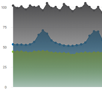
Area, Area Stacked, and Area Stacked [Percentage]
Plots groups in time order and evaluates how each group contributes to the whole. Area graphs display multiple time series stacked on the y-axis against equally spaced time intervals on the x-axis. Each line on the graph is the cumulative sum, so that you can see each series' contribution to the sum and how the composition of the sum changes over time.
Area
Each line on the graph is its original value. If you enter a single Metric(s) that is divided into groups by a Breakdown(s), each line uses the same y-axis. If you enter multiple fields under Metric(s), a y-axis is displayed for each line.
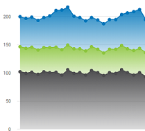
Area Stacked
Each line on the graph is the cumulative sum, so that you can see each series' contribution to the sum and how the composition of the sum changes over time. Minitab Connect places the group that comes last alphabetically or numerically at the bottom and continues to stack additional groups on top in reverse order.
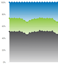
Area Stacked [Percentage]
Each line on the graph is the cumulative percentage, so you can see each series' contribution to the total percentage. Minitab Connect places the group that comes last alphabetically or numerically at the bottom and continues to stack additional groups on top in reverse order.
- Metric(s)
- Enter the variable to display on the y-axis. An area graph works best when you have a single field with every metric and a grouping variable that contains the categories that you enter in Breakdown(s).
- Dimension(s)
- Enter the variable to display on the x-axis. For an area graph, the x-axis is often a date/time field. Minitab Connect expects date formats with the day, month and year. If you import data with incomplete information (for example, no year), the data imports as a text field and may not display correctly in a visualization.
- Breakdown(s)
- Enter a grouping variable. The area for each group are graphed with different colors.
Column, Stacked Column, and Stacked Column [Percentage]
Compare the values of a metric using bars to represent groups or categories. In a column chart, the bars are vertical. In a bar chart, the bars are horizontal. The height of the bar shows the count. Arrange your data with numeric values in one or more fields and categories in another.
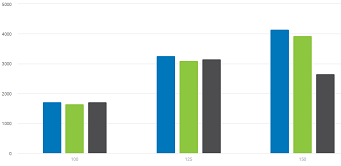
Column
Columns for each group specified by the Breakdown(s) field are next to each other.
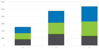
Stacked Column
Columns for each group specified by the Breakdown(s) field are stacked on top of each other. Minitab Connect places the group that comes last alphabetically or numerically at the bottom and continues to stack additional groups on top in reverse order. Each column on the graph is the cumulative sum, so that you can see each group's contribution to the sum.
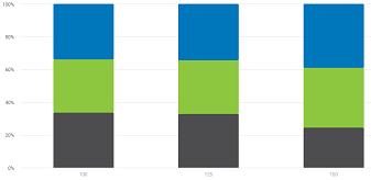
Stacked Column [Percentage]
Columns for each group specified by the Breakdown(s) field are stacked on top of each other. Minitab Connect places the group that comes last alphabetically or numerically at the bottom and continues to stack additional groups on top in reverse order. Each column on the graph is the total percentage, so that you can see each group's contribution to the sum.
- Metric(s)
- Enter the variable to display on the y-axis. By default, Metric(s) displays the count for a categorical variable and the sum for a numeric variable. You
can change the default by selecting the View button
 and selecting a different option from
Aggregate.
and selecting a different option from
Aggregate. - Dimension(s)
- Enter the categorical variable to display on the x-axis. Minitab Connect displays a column for each group based on this variable.
- Breakdown(s)
- Enter an additional grouping variable. The columns for each group are graphed with different colors.
- Drilldown
- Columns for each group specified by the Drilldown variable are nested inside of a single column instead of being next to each other.
When you select a column, you will drilldown to the next level. For example, you have
two grouping variables: Machine (1 or 2) and Shift (1, 2, or 3). If you enter Machine in
Dimension(s) and Shift in Drilldown, the column chart displays the metrics only for Machine 1 and Machine 2. Then if you
select the column for Machine 1, you will see a new column chart with the metrics for
Shift 1, 2, and 3 for Machine 1.
Note
Drilldown is available only if you select Column.
Bar, Stacked Bar, and Stacked Bar [Percentage]
Compare the values of a metric using bars to represent groups or categories. In a bar chart, the bars are horizontal. In a column chart, the bars are vertical. The length of the bar shows the value of the metric. Arrange your data with numeric values in one or more fields and categories in another.
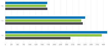
Bar
Bars for each group specified by the Breakdown(s) field are next to each other.
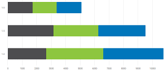
Stacked Bar
Bars for each group specified by the Breakdown(s) field are stacked on top of each other. Minitab Connect places the group that comes last alphabetically or numerically at the bottom and continues to stack additional groups on top in reverse order. Each bar on the graph is the cumulative sum, so that you can see each group's contribution to the sum.
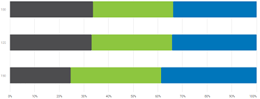
Stacked Bar [Percentage]
Bars for each group specified by the Breakdown(s) field are stacked on top of each other. Minitab Connect places the group that comes last alphabetically or numerically at the bottom and continues to stack additional groups on top in reverse order. Each bar on the graph is the total percentage, so that you can see each group's contribution to the sum.
- Metric(s)
- Enter the variable to display on the y-axis. By default, Minitab Connect displays the count for a categorical variable and the sum for a numeric variable. You
can change the default by selecting the View button and selecting a different option from
Aggregate.
- Dimension(s)
- Enter the categorical variable to display on the x-axis. Minitab Connect displays a bar for each group based on this variable.
- Breakdown(s)
- Enter an additional grouping variable. The bars for each group are graphed with different colors.
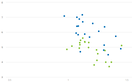
Scatterplot
Display ordered pairs of x and y variables in a coordinate plane. Use a Scatterplot to investigate the relationship between a pair of continuous variables.
- Metric(s)
- Enter a numeric variable to display on the y-axis.
- Dimension(s)
- Enter a numeric variable to display on the x-axis that might explain or predict changes in the Metric(s) variable.
- Breakdown(s)
- Enter a grouping variable. The points for each group are graphed with different colors.
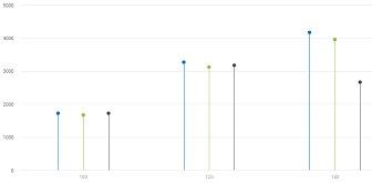
Lollipop
Compare the values of a metric using lollipops to represent groups or categories. A lollipop chart is similar to a column chart. Instead of using bars, a lollipop chart uses lines connected to a point. Arrange your data with numeric values in one or more fields and categories in another.
- Metric(s)
- Enter the variable to display on the y-axis. By default, Minitab Connect displays the count for a categorical variable and the sum for a numeric variable. You
can change the default by selecting the View button and selecting a different option from
Aggregate.
- Dimension(s)
- Enter the categorical variable to display on the x-axis. Minitab Connect displays a column for each group from this variable.
- Breakdown(s)
- Enter an additional grouping variable. The lollipops for each group are graphed with different colors.
Pie, Donut, Semicircle
Compare the proportion of data in each category or group. Arrange your data with numeric values in one field and categories in another.
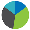
Pie
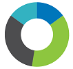
Donut

Semicircle
A pie chart displays an entire circle. A donut chart displays a circle with a hole in the middle. A semi circle displays half of a donut chart.
- Metric(s)
- Enter the numeric variable of interest to display on the y-axis.
- Dimension(s)
- Enter a categorical variable for the groups. Minitab Connect displays a slice for each group from this variable.
Bellcurve
Displays a normal curve based on the data you enter. The graph also displays the data as plotted points.
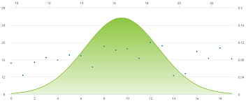
- Metric(s)
- Enter a numeric variable.
Histogram
Examine the shape and spread of your data. A histogram divides sample values into many intervals and represents the frequency of data values in each interval with a bar.
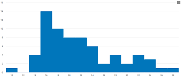
- Metric(s)
- Enter a numeric variable.
Pareto
Identify the most frequent defects, the most common causes of defects, or the most frequent causes of customer complaints. Pareto charts can help to focus improvement efforts on areas where the largest gains can be made.
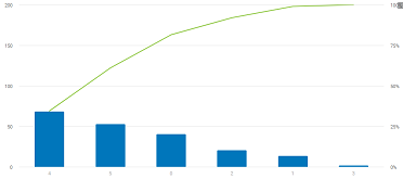
- Metric(s)
- Enter a field that contains the raw data. The field can be text or numeric, but it should have a single record for each instance of a defect.
- Combine Percent
- Minitab Connect generates bars for defect categories until the cumulative percentage surpasses the percentage that you specify. Then, Minitab Connect groups the remaining defects into a category labeled "Other".
Waterfall
Examine the cumulative effect of a series of positive and negative values on an initial value.
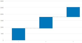
- Metric(s)
- Enter a numeric variable of interest to display on the y-axis.
- Dimension(s)
- Enter a categorical variable for the groups. Minitab Connect displays a waterfall for each group from this variable. If you use a date/time field,Minitab Connect expects date formats with the day, month and year. If you import data with only one or two of those, the field imports as a text field and may not display correctly on the graph.
Funnel
Examine a process that has sequentially connected stages.
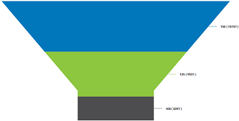
- Metric(s)
- Enter the numeric variable of interest to display on the y-axis. Minitab Connect places the group with the largest sum of this metric at the top of the funnel, and places the remaining groups below in decreasing order.
- Dimension(s)
- Enter a categorical variable. Minitab Connect uses this variable to divide the funnel into layers.
Pyramid
Examine the process that has a structured hierarchy.
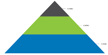
- Metric(s)
- Enter the numeric variable of interest to display on the y-axis. Minitab Connect places the group with the largest sum of this metric at the bottom of the pyramid, and places the remaining groups above in decreasing order.
- Dimension(s)
- Enter a categorical variable. Minitab Connect uses this variable to divide the pyramid into layers.
Heatmap
Investigate the relationship between two categorical variables and a numeric variable. The sum of the numeric variable for each group determines the color gradient for each rectangle. The color gradient is the shade that Minitab Connect colors the rectangles. You can compare the different shades of the rectangles to determine extreme values or detect patterns.
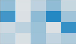
- Metric(s)
- Enter a numeric variable. The sum of this variable determines the color gradient for each rectangle.
- Dimension(s)
- Enter the categorical variable to display on the x-axis.
- Breakdown(s)
- Enter an additional grouping variable for the y-axis.
Treemap
Examine hierarchical data using nested rectangles. The number of observations for each category determines the size of the rectangle. The sum of the numeric variable for each group determines the color gradient for each rectangle.
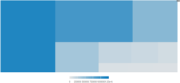
- Metric(s)
- Enter a numeric variable. The sum of this variable determines the color gradient for each rectangle.
- Dimension(s)
- Enter a categorical variable. The number of observations for each category determines the size of the rectangle for that category.
Stream Graph
Display one or more series centered around a central axis.
- Metric(s)
- Enter the numeric variable of interest to display on the y-axis. You can enter more than one metric.
- Dimension(s)
- Enter the variable to display on the x-axis. For a stream graph, the x-axis is often a date/time field. Minitab Connect expects date formats with the day, month and year. If you import data with incomplete information (for example, no year), the data imports as a text field and may not display correctly in a visualization.
Word Cloud
Display a collection of words in different sizes. The number of instances of the word determines its size.
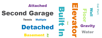
- Metric(s)
- Enter a categorical variable that is a list of words.
Big Number
Displays a big number. If you enter a numeric variable in Metric(s), Minitab Connect displays the sum of the observations. If you enter a text variable in Metric(s), Minitab Connect displays a count of the total number of observations.
US Map and Global Map
Displays a map of the United States or the world that colors each state or country based on a numeric variable.
- Metric(s)
- Enter a numeric variable. The sum of this variable determines the color gradient of the state or country.
- Dimension(s)
- Enter a text field that includes the name of the states, the countries, the country codes, or the zip codes. If the field contains the names of states, you can use either the full state name or the two letter abbreviation.