A quality engineer for an automotive supply company wants to decrease the number of car door
panels that are rejected because of paint flaws. As part of the initial
investigation, the engineer creates a bar chart to compare the counts of paint
flaws. The data are in the wrong format for a bar chart, so the engineer must create
a saved view of the table with the Prep tool ![]() .
.
Note
This example explains how to prepare data so you can create a bar chart. You can use the same steps for many other charts, including column charts, pie charts, funnel charts, and pyramid charts.
-
Open the Prep tool
 .
This example uses the data set in the Minitab Data Set Library, Paint flaws data.
.
This example uses the data set in the Minitab Data Set Library, Paint flaws data. Note
You cannot import a Minitab worksheet (MTW) into Minitab Connect. To import the data, save it as a CSV, XLSX, or copy and paste it. For more information on how to import data, go to Common tasks using the Base tool and select Import data to a new table from an Excel file.
-
On the Fields tab, select Add a Field and select Flaws to add a second
instance of the Flaws field.
Note
If you just imported your data, you may need to select Reset Config
 to display the
table.
to display the
table. - Rename the second instance of Flaws to Counts.
-
Select the View button
 next to the Counts field and
select Count.
next to the Counts field and
select Count.
-
Select Run
 , and then select Save
 .
.
- Under View, select New View. Under Name, enter Flaws Summary Data. Then select Save.
-
Open the Visualize tool
 .
From the Current Config dropdown list, select Flaws Summary Data.
.
From the Current Config dropdown list, select Flaws Summary Data.
- From Type, select Bar. Under Metric(s), select Flaws. Under Dimension(s), select Count.
-
Select Run
.
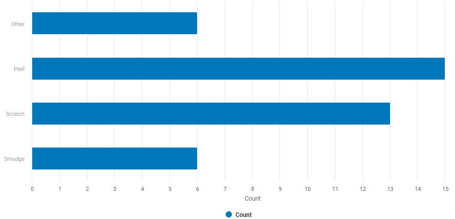
Interpret the results
Peel is the most common paint flaw, and Smudge and Other are the least common paint flaws.