Add a slicer to the dashboard to easily narrow a number range, date range, or set of categories instead of creating a new view with that filter in the table.
In this example, the marketing analyst knows that their supervisors are interested in customers between the ages of 40 and 60. The analyst creates a bar chart to show the number of books per genre that customers buy. Then, the analyst adds a slicer in the dashboard to show only customers between the ages of 40 and 60.
-
Select the Assets icon
 and double click Bar Chart.
- Select Open.
- In Categorical variables enter Genre.
- Select Create. Expand the chart to better view the y-axis scale.
-
Select the Assets icon and under Controls, double click Number Range Slicer.
- On the Number Range Slicer pane, under Select one or more variables select Age.
- In the number range, enter 40 for the lower endpoint and 60 for the upper endpoint.
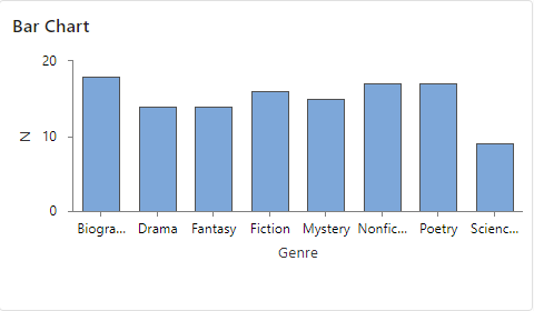
Each dashboard asset displays only data for customers aged 40 to 60. The analyst sees that this group purchased between 13 and 16 books in each genre, except Science Fiction, which had only 8 purchases.
