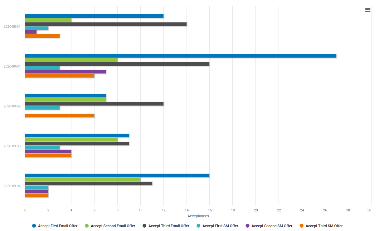
In the previous section, the analyst created various spline charts that show the number of acceptances for all email and social media offers for all genre types. While spline charts are useful, the analyst wants to explore other chart types.
Under Type, select Bar to create a bar chart.Investigate other chart types to see which one works best for your
application.
Select Run to generate your
chart.
Select Save to save this
visual.
Under Visual, select New Visual and enter a Name. For this example, enter All Offers on Same Scale Bar
Chart.
Select Save.
Like the spline chart, this bar chart also shows the number of acceptances for all email and social media offers, by date.
The analyst uses this chart to easily compare the number of acceptances between email and social media offers.
Use the advanced options
Feel free to explore the graph options on the Options tab. Each graph type has several available options, such as legend placement,
display of minimum and maximum scale values, and colors.
 , open the Save(s) tab.
 to generate the
chart.
to generate the
chart.
 to save this
visual.
to save this
visual.