Add a control chart
To add a control chart, drag and place the control chart from the Assets pane ![]() onto the canvas. Minitab Connect adds a placeholder asset card that contains the default title, a representation
of the asset, and a dropdown that contains the data views associated with the
dashboard. Select the data view you want to use for the control chart. Then select
Open to open the dialog for the control chart.
onto the canvas. Minitab Connect adds a placeholder asset card that contains the default title, a representation
of the asset, and a dropdown that contains the data views associated with the
dashboard. Select the data view you want to use for the control chart. Then select
Open to open the dialog for the control chart.
Note
You must select a data view before you can create an asset. Use the
Data panel ![]() to select a data view.
to select a data view.
Control charts
- Individuals Chart
- Use Individuals Chart to monitor the mean of your process when you have continuous data that are individual observations that are not in subgroups. Use this control chart to monitor process stability over time so that you can identify and correct instabilities in a process.
- I-MR Chart
- Use an I-MR Chart to monitor the mean and variation of your process when you have continuous data that are individual observations not in subgroups. Use this control chart to monitor process stability over time so that you can identify and correct instabilities in a process.
- Laney P' Chart
- Use a Laney P' Chart (P' is pronounced as P prime) to monitor the proportion of defective items that are produced by your process and to adjust for overdispersion or underdispersion in your data. Overdispersion can cause a traditional P chart to show an increased number of points outside the control limits. Underdispersion can cause a traditional P chart to show too few points outside of the control limits. The Laney P' chart adjusts for these conditions. For more information, go to Overdispersion and underdispersion.
- Xbar-R Chart
- Use an Xbar-R Chart to monitor the mean and variation of a process when you have continuous data and subgroup sizes of 8 or less. Use this control chart to monitor process stability over time so that you can identify and correct instabilities in a process.
- Xbar-S Chart
- Use an Xbar-S Chart to monitor the mean and variation of a process when you have continuous data and subgroup sizes of 9 or more. Use this control chart to monitor process stability over time so that you can identify and correct instabilities in a process.
- U Chart
- Use a U Chart to monitor the number of defects per unit, where each item can have multiple defects. Use this control chart to monitor process stability over time so that you can identify and correct instabilities in a process.
- P Chart
- Use a P Chart to monitor the proportion of defective items where each item can be classified into one of two categories, such as pass or fail. Use this control chart to monitor process stability over time so that you can identify and correct instabilities in a process.
- C Chart
- Use a C Chart to monitor the number of defects where each item can have multiple defects. You should use a C chart only when your subgroups are the same size. Use this control chart to monitor process stability over time so that you can identify and correct instabilities in a process.
- EWMA Chart
- Use an EWMA Chart to detect small shifts in the process mean, without influence by low and high values. The EWMA chart monitors exponentially weighted moving averages, which remove the influence of low and high values. The observations can be individual measurements or subgroup means. An advantage of EWMA charts is that they are not greatly influenced by low or high values.
Enter your data
The method to enter your data depends on the type of control chart. Select the option below that matches your data entry setup.
Variable
For an Individuals Chart, I-MR Chart, and C Chart, all the measurements for a variable must be in one column. In Variable, enter one column of measurement data.
| C1 |
|---|
| Weight |
| 785.92 |
| 830.36 |
| 798.43 |
| 812.56 |
| 799.63 |
| 822.72 |
| 786.64 |
| 803.66 |
| 811.29 |
| 826.74 |
All observations for a chart are in one column and Observations for a subgroup are in one row of columns
- All observations for a chart are in one column
-
If the measurement data are in one column, select this option, then enter a column of measurement data. In Subgroup sizes, if all subgroups are the same size, enter the subgroup size. Otherwise, enter a column of values that identifies which subgroup each measurement is from.
In this worksheet, Measurements contains the measurement data. Subgroup identifies which subgroup each measurement is from.C1-T C2 Subgroup Measurements One 10 One 13 One 10 Two 8 Two 8 Two 9 - Observations for a subgroup are in one row of columns
-
If each row in the worksheet contains the measurement data for one subgroup, select this option, then enter the columns that contain the measurement data.
In this example, Measurement_1, Measurement_2, and Measurement_3 contain the measurement data. The data for subgroup 1 are in row 1, the data for subgroup 2 are in row 2, and so on.C2 C3 C4 Measurement_1 Measurement_2 Measurement_3 10 13 10 8 8 9
Variable and Subgroup sizes
For a Laney P' Chart, U Chart, and P Chart, you must enter a variable column and specify the subgroup size. In Variable, enter the column that contains the process data.
- If all subgroups are the same size, enter the size (for example, 55).
- Enter a column that contains the size of each subgroup.
| C1 | C2 |
|---|---|
| Irregularities | Yards Sampled |
| 10 | 120 |
| 8 | 110 |
| 7 | 110 |
| 7 | 115 |
Weight of EWMA
In Weight of EWMA, enter the weight to use in the exponentially weighted moving average. The value must be between 0 and 1. If you change the default weight (0.2) and the number of standard deviations for the control limits, you can construct a chart with specific properties. Choose the weight based on how small of a shift you want to detect and how fast you want to detect that shift while maintaining an acceptable false alarm rate. You can choose combinations of these two parameters by using an ARL (average run length) table. See Lucas et al.1 for an extensive table.
Scale
Specify a time scale for the x-axis.
- Index
-
Label the x-axis with the number of the subgroup.
- Stamp
-
Label the x-axis with values from a column. In Stamp column, enter a column that contains date/time, numeric, or text values for the scale.
Parameters
- Mean
- Enter a single mean for the entire chart. The mean is used to calculate the center line on the individuals chart.
- Standard deviation
- Enter a single standard deviation for the entire chart. The standard deviation is used to calculate the control limits on both charts and the center line on the moving range chart.
- Proportion
- Enter a single proportion for the entire chart.
Estimate
The following options are on the Estimate tab of the Options sub-dialog.
Specify observations to estimate parameters
If some observations have erratic data because of special causes that you have corrected, you can omit these observations from the calculations to avoid incorrect parameter estimates.
- From the dropdown list, specify whether you want to list the
observations to omit, or the observations to include.
- To list the observations to omit, select Omit the following subgroups when estimating parameters.
- To list the observations to include, select Use the following subgroups when estimating parameters.
-
List the observations. Use a colon to indicate a range of observations. Leave a space between each observation or range of observations.
For example, to specify observations 2, 9, 44, 45, 46, and 47, enter 2 9 44:47.
Method for estimating standard deviation
- Average moving range
- The average moving range is the average value of the moving range of two or more consecutive points. Use this method when the subgroup size is 1.
- Median moving range
- The median moving range is the median value of the moving range of two or more consecutive points. Use this method when the data have extreme ranges that influence average of the moving ranges.
- Rbar
- Rbar is the average of the subgroup ranges. The Rbar method is a common estimate of the standard deviation and works best with subgroup sizes from 2 to 8.
- Sbar
- Sbar is the average of the subgroup standard deviations. The Sbar method provides a more precise estimate of the standard deviation than Rbar, especially with subgroup sizes greater than 8.
- Square root of MSSD
- The square root of MSSD is the square root of the mean of the squared differences between consecutive points. Use this method when you cannot reasonably assume that at least 2 consecutive points were collected under similar conditions.
- Pooled standard deviation
- The pooled standard deviation is the weighted average of subgroup variances, which gives larger subgroups more influence on the overall estimate. The pooled standard deviation method provides a more precise estimate of the standard deviation when the process is in control.
Select Use unbiasing constant to eliminate bias that can occur when you estimate certain process parameters. Often, the choice to use unbiasing constants depends on company policy or industry standards.
Length of moving range
Enter the number of observations that are used to calculate the moving
range. By default, a length of 2 is used because consecutive values have the
greatest chance of being alike. The length must be  100.
100.
If the data are cyclical, consider using a moving range of a different length. For example, if you collect quarterly data, consider using a moving range of length 4 to ensure that one observation from each season is included in the calculation.
Use Nelson estimate
On the Estimate tab of the I-MR Options subdialog, select Use Nelson estimate to correct for unusually large moving range values in the calculation of the control limits. The procedure is similar to the procedure proposed by Nelson. Connect eliminates any moving range values that are more than 3 standard deviations larger than the average moving range, then recalculates the average moving range and the control limits.
Limits
By default, Connect calculates the control limits using the actual subgroup sizes. When the subgroup sizes differ, the control limits are uneven, but you can force the control limits to be straight. Under When subgroup sizes are unequal, calculate control limits, select Assuming all subgroups have size, and enter a subgroup size.
CAUTION
When you specify a subgroup size, you change the calculations for the control limits, which can change the results of the tests for special causes. Use this option only if the differences between the subgroup sizes are small. Don't use this option when the difference between subgroup sizes is more than 25%. For example, if the largest subgroup has 10 observations and the smallest subgroup has 8 observations, then the difference is 20% ((10 - 8) / 10 = 0.2 = 20%).
For example, the data for the following charts is the same, but the control limits for the second chart were calculated based on a fixed subgroup size.
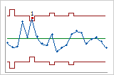
Actual subgroup sizes
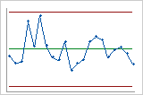
Fixed subgroup size
Tests
On the Options subdialog, Connect provides one to eight tests for special causes, depending on the control chart. By default, Connect uses only Test 1. Select additional tests based on company or industry standards. Use the tests to determine which observations to investigate, and to identify the specific patterns and trends in your data.
In the dropdown list, specify whether to perform some, all, or no tests for special causes. You can make each test more or less sensitive by changing the value of K.
- 1 point > K standard deviations from center line
- Test 1 identifies subgroups that are unusual compared to other subgroups. Test 1 is universally recognized as necessary for detecting out-of-control situations. If small shifts in the process are of interest, you can use Test 2 to supplement Test 1 in order to create a control chart that has greater sensitivity.
- K points in a row on same side of center line
- Test 2 identifies shifts in the process centering or variation. If small shifts in the process are of interest, you can use Test 2 to supplement Test 1 in order to create a control chart that has greater sensitivity.
- K points in a row, all increasing or all decreasing
- Test 3 detects trends. This test looks for a long series of consecutive points that consistently increase in value or decrease in value.
- K points in a row, alternating up and down
- Test 4 detects systematic variation. You want the pattern of variation in a process to be random, but a point that fails Test 4 might indicate that the pattern of variation is predictable.
- K out of K+1 points > 2 standard deviations from center line (same side)
- Test 5 detects small shifts in the process.
- K out of K+1 points > 1 standard deviation from center line (same side)
- Test 6 detects small shifts in the process.
- K points in a row within 1 standard deviation of center line (either side)
- Test 7 detects a pattern of variation that is sometimes mistaken as evidence of good control. This test detects control limits that are too wide. Control limits that are too wide are often caused by stratified data, which occur when a systematic source of variation is present within each subgroup.
- K points in a row > 1 standard deviation from center line (either side)
- Test 8 detects a mixture pattern. In a mixture pattern, the points tend to fall away from the center line and instead fall near the control limits.
Stages
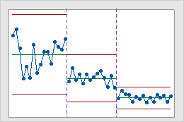
This historical control chart shows three stages of a process, which represent before, during, and after the implementation of a new procedure.
In the example below, the values in the Stage column change from 1 to 2 to indicate the beginning of stage 2. The values change from 2 to 3 to indicate the beginning of stage 3.
| C1 | C2 |
|---|---|
| Measurements | Stage |
| ... | ... |
| 9 | 1 |
| 10 | 1 |
| 8 | 2 |
| 11 | 2 |
| ... | ... |
| 7 | 2 |
| 8 | 2 |
| 5 | 3 |
| 7 | 3 |
| ... | ... |
Display
To see only the most recent observations instead of all observations, enter the number of observations to include in the chart. Connect still uses all the data to calculate the control limits and the center line.
Note
By default, Connect displays the last 25 observations. This is different than Minitab Statistical Software, which displays all observations by default. This could result in different results if you don't change the settings making charts with the same data between the two applications.
- All
-
Connect displays all observations.
- Last
-
This chart displays only the most recent number of observations that you enter.
Add reference lines and alerts to control charts
Reference lines
- Name
- The name you specify appears on the right side of the chart beside the reference line.
- Value
- Enter a value on the y-axis for the reference line.
- Operator
- Set an alert to the control chart. You can have the alert notify you
if there is a point greater than or less than the reference line. Or
you can turn alarms off for the reference line.
Note
If you turn on an alert for a reference line, you still need to create a new alert to receive a notification. See the following section for more information on how to set up a new alert.
- Line Color
- Specify a color for the reference line.
After you add a reference line, you can use the Graph Options tab to change the value, color, and name of the line, change the alert status, or delete the line.
Dashboard Alerts
- Name
- The name of the alert.
- Type
- The type of alert. You can choose from an email, text message, or Connect notification.
- To
- Select one or more persons to receive the alert.
For emails and texts, use the dropdown list to select a user to add them to the alert. If you want to add an email or phone number for a person that is not in the dropdown list, type it into the box. After Connect verifies that it is valid, select Press Enter to Add Email or Press Enter to Add Phone Number to add it to the alert.
United States phone numbers must be 10 digits with any combination of parentheses, periods, dashes, and spaces as delimiters. Parentheses can only be used on the area code. International phone numbers must start with a + symbol and can contain up to 15 digits with no spaces or delimiters.
- Subject Line
- Enter the subject line of the email when you select Email as the type of alert.
- Message
- Create the message the alert sends.
- Tests for special causes
- Set the alert to the tests that you select. You can only select
tests that you selected on the Control Chart options sub dialog when
you created the chart. You can edit the tests for special causes for
existing control charts by selecting the Open icon
 , selecting the
Options button, then selecting the Tests tab.
, selecting the
Options button, then selecting the Tests tab. - Reference Lines
- Set the alert to any references lines you added to the control chart. You can use the Graph Options tab on the right navigation to change the value and the alert status of the line.
To enable, disable, edit, or delete an alert after you create it, select the ellipsis ![]() in the header bar and select
Manage Alerts.
in the header bar and select
Manage Alerts.
Connect Alarms
- The status of the alarm. A green circle indicates the alarm is enabled. A red circle indicates the alarm is disabled.
- The name of the alarm.
- The table or view that is linked to the alarm.
- The dashboard that is linked to the alarm.
- The type of graph or chart that is linked to the alarm.
- The unique identifier for the alarm.