Step 1: Examine the interaction effects
Examine the two-way interaction effects in the interaction plot. This plot shows how the relationship between the response variable and a predictor depends on the value of a second predictor.
- Parallel lines
- No interaction occurs.
- Nonparallel lines
- An interaction occurs. The less parallel the lines are, the greater the strength of the interaction.
Although you can use this plot to display the effects, be sure to evaluate the statistical significance of the effects in the analysis that fit the model. If the interaction effects are statistically significant in that analysis, you cannot interpret the main effects without considering the interaction effects.
- Means for response variables that contain continuous measurements, such as length or weight.
- Means for response variables that contain counts that follow the Poisson distribution, such as the number of defects per sample.
- Probabilities for response variables that contain only two possible outcomes, such as pass/fail.
- Standard deviations for models that are fit using Analyze Variability.
- If the second predictor is categorical, then the plot displays a separate line for each level of that predictor.
- If the second predictor is continuous, then the plot displays a line for the lowest and the highest value of that predictor in your sample data.
Note
For mixture designs, interaction plots display only data means. For more information about the types of means, go to Data and fitted means.
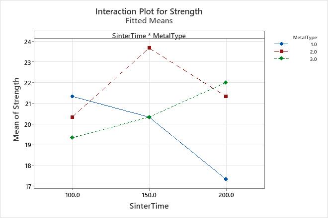
Key Result: Interaction plot
In this interaction plot, the lines are not parallel. This interaction effect indicates that the relationship between metal type and strength depends on the value of sinter time. For example, if you use MetalType 2, then SinterTime 150 is associated with the highest mean strength. However, if you use MetalType 1, then SinterTime 100 is associated with the highest mean strength.
The Fit General Linear Model results indicate that the interaction between SinterTime and MetalType is significant.
Step 2: Examine the main effects
Examine the main effects plot to assess the relationship between the response and the predictors.
- When the line is horizontal (parallel to the x-axis), no main effect is present. The response value does not vary by the value of the predictor.
- When the line is not horizontal, a main effect is present. The response value is not the same for all values of the predictor. The steeper the slope of the line, the greater the magnitude of the main effect.
Although you can use this plot to display the effects, be sure to evaluate the statistical significance of the effects in the analysis that fit the model. If the interaction effects are statistically significant in that analysis, you cannot interpret the main effects without considering the interaction effects.
- Means for response variables that contain continuous measurements, such as length or weight.
- Means for response variables that contain counts that follow the Poisson distribution, such as the number of defects per sample.
- Probabilities for response variables that contain only two possible outcomes, such as pass/fail.
- Standard deviations for models that are fit using Analyze Variability.
- If the predictor is categorical, the plot displays a point for the response value for each level of that predictor. A line connects the points for each variable. Minitab also draws a reference line at the overall mean for continuous and Poisson response variables.
- If the predictor is continuous, the plot displays a line that represents the continuous relationship between the response and predictor.
Note
For mixture designs, main effects plots display only data means. For more information about the types of means, go to Data and fitted means.
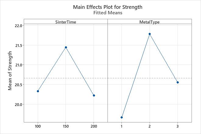
Key Result: Main effects plot
In this main effects plot, SinterTime 150 appears to be associated with the highest mean strength. However, the Fit General Linear Model results indicate that this main effect is not statistically significant. The difference between factor levels may be caused by random chance.
MetalType 2 is associated with the highest mean strength, and the Fit General Linear Model results indicate that this main effect is statistically significant.
The Fit General Linear Model results indicate that the interaction between SinterTime and MetalType is statistically significant. Consequently, you cannot interpret the main effects without considering the interaction effect.