In This Topic
What is a variability chart?
A variability chart is a graphical representation of the relationships between factors and a response. Use a variability chart to present analysis of variance data in a graphical form especially in the preliminary stages of data analysis to view data, possible relationships, and root causes for variation. Variability charts are especially useful in understanding interactions.
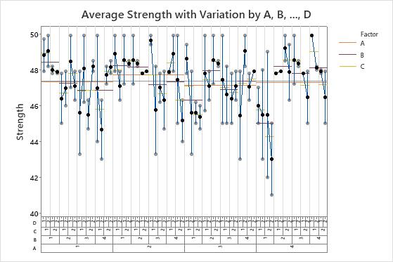
Minitab draws variability charts for up to eight factors. The chart displays the means at each factor level combination.
Example of a four-factor variability chart with mean connect lines for factor level means
In this example, Factor A and B have four levels each and Factor C and Factor D have two levels.
The chart that shows the average measurements separates the factor level combinations with vertical lines. Each cell displays the data points and the means for the factor level combinations. For example, the first cell shows the data points and the means for the factor level combination of A=1, B=1, C=1, D=1 and 2.
- A horizontal line that spans the first 8 cells shows the mean for factor A when A=1.
- A horizontal line that spans the first 2 cells shows the mean for factor B when B=1.
- A horizontal line that spans the first cell shows the mean for factor C when C=1.
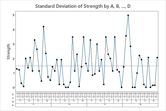
The standard deviation chart shows the standard deviation for each factor level combination. The standard deviations in this example seem to vary relatively consistently.