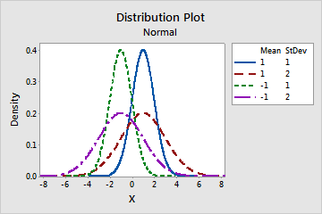
Step 1: View the shape of the distribution
Use a probability distribution plot to view the shape of the distribution or distributions that you specified.
Each distribution has a unique curve. When you change the parameters of the distribution, you can see how the distribution curve changes.
For example, use this probability distribution plot to compare different normal distributions when the mean and standard deviation values change.
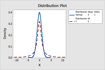
Step 2: Compare distributions
Use a probability distribution plot to compare different distributions. For example, an engineer wants to know whether one distribution is approximately similar to other distributions under certain conditions.
This probability distribution plot compares a normal distribution and a t-distribution.
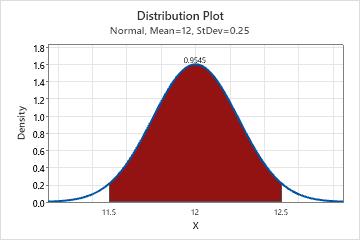
Step 3: Determine the probability of a shaded area
Use a probability distribution plot to determine the probabilities of specific data values within the distribution. Minitab shades the region that you specify and displays the x-values and the probability.
For example, in the following probability distribution plot, the shaded region is between the x-values 11.5 and 12.5. The probability of the shaded region is 0.9545.