Choose data display elements
The following images show the elements that you can display on a bar chart. To select elements when you create the graph, click Data View.
- Double-click the graph.
- Right-click the graph and choose .
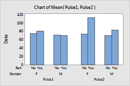
Bars (default)
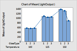
Bars, symbols, and connect line
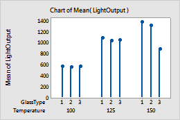
Symbols and project lines
Note
For more information on editing these graph features, go to the following topics.
Make groups look different
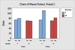
When you create a bar chart with groups, you can represent the groups for specified variables with different colors. When you create the graph, click Data View and enter the variables in Categorical variables for attribute assignment.
Default
Different colors for Gender
Note
For information on how to change the attribute assignment variables for existing data display elements, go to Display groups on graphs.
Apply existing groups when you add new elements
- Double-click the graph.
- Right-click the graph and choose .
To apply the existing legend groups when you add a new element, select Apply attribute assignment variables of current displays to added displays.
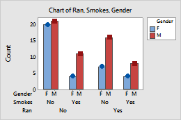
For example, the bars in the following bar chart are different colors for the different levels of the Gender variable.
Note
For information on adding or changing the grouping variables for an existing graph, go to Display groups on graphs.
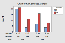
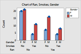
If you add symbols, but do not select Apply attribute assignment variables of current displays to added displays, all of the symbols are the default blue color and round shape. If you select this option, then the colors of the symbols match the colors of the bars and the shapes of the symbols are different for each level of Gender.
Not selected
Selected
Note
For information on how to change the attribute assignment variables for existing data display elements, go to Display groups on graphs.
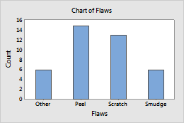
Arrange bars by height
By default, when you graph counts of unique values or a function of a variable, Minitab arranges the bars in increasing order by category name (for example: Group 1, Group 2, Group 3). For text values, you can specify a different order by changing the column properties in the worksheet. For more information, go to Change the display order of text values in Minitab output. When you graph values from a table, Minitab uses the order of the rows in the worksheet.
- Double-click the graph.
- Right-click the graph and choose Graph Options.
- Under Order Main X Groups By, select one of the following options.
Default
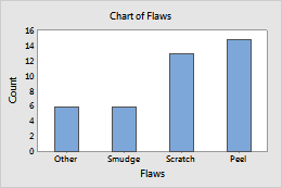
Increasing Y
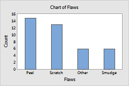
Decreasing Y
Use a percent scale or a cumulative scale on y
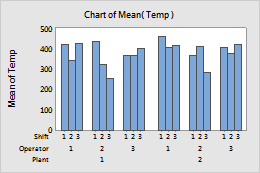
You can change the y-scale on a bar chart to a percentage scale, a cumulative scale, or both. When you create a bar chart, click Chart Options.
- Double-click the graph.
- Right-click the graph and choose Graph Options.
- Under Percent and Accumulate, select one or both of the following options.

Default y-scale
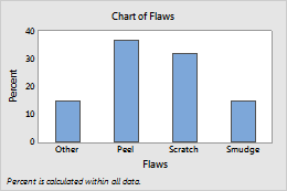
Show Y as Percent selected
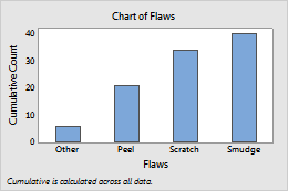
Accumulate Y across X selected
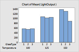
Choose the level for accumulation and percent calculations
Under Take Percent and/or Accumulate, you can specify whether to calculate percents and accumulate values across the entire chart, or within the categories of the specified variable.
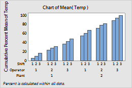
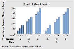
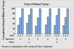
For example, the scales on the following bar charts are cumulative percent scales. The level-1 variable (also called the outermost variable) is Plant. For more information, go to Categorical scale. The level-2 variable is Operator.
- Across all categories
- When you choose Across all categories, the bars accumulate to 100% across the entire chart.
- Within categories at level 1 (outermost)
- When you choose Within categories at level 1 (outermost), the bars accumulate to 100% within each level of Plant.
- Within categories at level 2
- When you choose Within categories at level 2 the bars accumulate to 100% within each level of Operator.
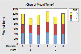
Stack innermost groups
- Double-click the graph.
- Right-click the graph and choose Graph Options.
- Select Stack innermost groups and then specify whether to show the first group at the top of the stack or at the bottom of the stack.
Not stacked
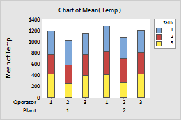
First group at Top of stack