In This Topic
Step 1: Look for relationships between the x and y variables
Look for variables that tend to increase or decrease in value together.

Linear: positive

Linear: negative
No relationship
If your data seem to have a relationship, you can explore the relationship using a regression analysis.
Step 2: Look for patterns in bubble size
Look for increasing or decreasing trends, and assess how consistent the patterns are.
Look for trends
Bubbles that become tend to become smaller or larger, as the values on the horizontal or vertical scale increase, may indicate trends.
Assess the consistency of patterns
Determine areas where bubbles differ in size from adjacent bubbles. More consistency in bubble size in certain areas means there is less variation in the relationship between the variables. Less consistency in the bubble size in certain areas means there is more variation in the relationship.
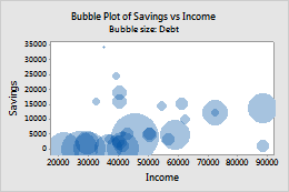
For example, this graph shows the relationship between the savings, income, and amount of debt for consumers who apply for a bank loan. Larger bubbles (more debt) are clustered where savings and income are low. Smaller bubbles (less debt) occur where income is approximately 35,000 to 70,000, regardless of savings.
.