A bank requires eight pieces of information from loan applicants: income, education level, age, length of time at current residence, length of time with current employer, savings, debt, and number of credit cards. A bank administrator wants to analyze this data to determine the best way to group and report it. The administrator collects this information for 30 loan applicants.
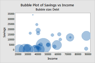
The administrator creates a bubble plot to compare the amount of income, savings, and credit card debt that each applicant has.
- Open the sample data, LoanApplicant.MWX.
- Choose .
- In Y variable, enter Savings.
- In X variable, enter Income.
- In Bubble size variable, enter Debt.
- Click OK.
Interpret the results
The bubble plot shows that the relationship between income and savings for the applicants is not simple. In general, higher incomes may be associated with slightly higher levels of savings. However, the applicants with the highest savings do not have the highest incomes.
The applicants who have the most debt (largest bubbles) tend to have little or no savings. However, many applicants who have little or no savings also do not have very much debt, as evidenced by the smaller bubbles near the bottom of the graph.