At an umbrella manufacturing facility, umbrella handles are measured and then removed from the assembly line if they don't meet specifications. A daily report indicates how many rejected handles were produced by each of three presses at the facility during each of three shifts. A quality engineer wants to determine whether press and shift are associated. As part of the initial investigation, the engineer creates a bar chart to compare the number of rejected handles for each machine and shift.
- Open the sample data, UmbrellaHandles.MWX.
- Choose .
- In Graph variables, enter '1st shift', '2nd shift', and '3rd shift'.
- In Row labels, enter 'Machine ID'.
- Click OK.
Interpret the results
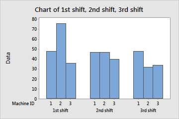
The highest number of rejected handles is made by machine 2 during the first shift. The lowest number of rejected handles is made by machine 2 during the 3rd shift.