Choose , then select a 3D scatterplot based on how you want the plot to look.
In This Topic
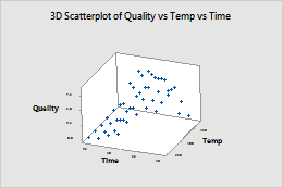
Simple
Create a 3D scatterplot that displays predictor variables on the x-axis and y-axis and the response variable on the z-axis. For example, the following scatterplot shows the relationship between quality, time, and temperature.
For more information, go to Create a simple 3D scatterplot.
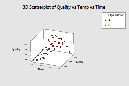
With Groups
Create a 3D scatterplot that displays predictor variables on the x-axis and y-axis and the response variable on the z-axis, divided into groups. Groups are represented by different colors and symbols. For example, the following scatterplot shows the relationship between quality, time, and temperature for each operator.
For more information, go to Create a 3D scatterplot with groups.