In This Topic
Step 1: Determine whether the within-subgroup variation is in control
In the I-MR-R/S chart, use the R chart or the S chart to evaluate variability within subgroups. An R or S chart is displayed based on your subgroup size. When the subgroup size is 8 or less, an R chart is displayed. When the subgroup size is 9 or more, an S chart is displayed.
The R chart plots the subgroup ranges. If the subgroup size is constant, then the center line on the R chart is the average of the subgroup ranges. If the subgroup sizes differ, then the value of the center line depends on the subgroup size, because larger subgroups tend to have larger ranges. The control limits on the R chart, which are set at a distance of 3 standard deviations above and below the center line, show the amount of variation that is expected in the subgroup ranges.
The S chart plots the subgroup standard deviations. The center line is the average of all subgroup standard deviations. The control limits on the S chart, which are set at a distance of 3 standard deviations above and below the center line, show the amount of variation that is expected in the subgroup standard deviations.
Red points indicate subgroups that fail at least one of the tests for special causes and are not in control. If the same point fails multiple tests, then the point is labeled with the lowest test number to avoid cluttering the graph. If the chart shows out-of-control points, investigate those points.
Out-of-control points can influence the estimates of process parameters and prevent control limits from truly representing your process. If out-of-control points are due to special causes, then consider omitting these points from the calculations. For more information, go to Specify how to estimate the parameters for I-MR-R/S Chart.
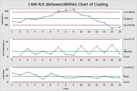
In these results, the R chart is displayed because the subgroup size is 3. No points are out of control. The within-subgroup variability is stable.
Step 2: Determine whether the between-subgroup variation is in control
In the I-MR-R/S chart, the Moving Range (MR) chart assesses whether the between-subgroup variation is in control. The Moving Range chart plots the moving ranges of the subgroup means. The center line is the average of all moving ranges. The control limits on the Moving Range chart, which are set at a distance of 3 standard deviations above and below the center line, show the amount of variation that is expected in the moving ranges.
Red points indicate subgroups that fail at least one of the tests for special causes and are not in control. If the same point fails multiple tests, then the point is labeled with the lowest test number to avoid cluttering the graph. If the chart shows out-of-control points, investigate those points.
Out-of-control points can influence the estimates of process parameters and prevent control limits from truly representing your process. If out-of-control points are due to special causes, then consider omitting these points from the calculations. For more information, go to Specify how to estimate the parameters for I-MR-R/S Chart.
In these results, no points are out of control on the MR chart. The between subgroup variability is stable.
Step 3: Determine whether the process mean is in control
The Individuals (I) chart assesses the stability of the means of the subgroup averages over time. The Individuals chart plots the subgroup means. The center line is an estimate of the average of the subgroup means. The control limits on the I chart, which are set at a distance of 3 standard deviations above and below the center line, show the amount of variation that is expected in the subgroup means.
Red points indicate subgroups that fail at least one of the tests for special causes and are not in control. If the same point fails multiple tests, then the point is labeled with the lowest test number to avoid cluttering the graph. If the chart shows out-of-control points, investigate those points.
Out-of-control points can influence the estimates of process parameters and prevent control limits from truly representing your process. If out-of-control points are due to special causes, then consider omitting these points from the calculations. For more information, go to Specify how to estimate the parameters for I-MR-R/S Chart.
In these results, 5 points are out of control. The subgroup averages are not stable over time. When you hold the pointer over a red point, you can get more information about that point.
Step 4: Identify which points failed each test
Investigate any subgroups that fail the tests for special causes. By default, Minitab conducts only Test 1, which detects points that fall outside of the control limits. However, if you conduct additional tests, then points can fail multiple tests. The output shows exactly which points failed each test, as shown here.
Test Results for I Chart of Subgroup Means of Coating
| TEST 1. One point more than 3.00 standard deviations from center line. |
|---|
| Test Failed at points: 7, 8, 9, 14, 15 |
Standard Deviations
| Between | 0.0000 |
|---|---|
| Within | 13.5854 |
| Between/Within | 13.5854 |
Note
When you use several tests at the same time, the sensitivity of the chart increases. However, the false alarm rate also increases, which can make you react to the test results unnecessarily.
For more information on each of the tests and when to use them, go to Using tests for special causes in control charts.