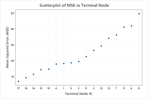
When the node splitting method is least squared error, the y-axis shows Mean Square Error (MSE). When the node splitting method is least absolute deviation, then the y-axis is Mean Absolute Deviation (MAD). The x-axis shows the identification numbers for the terminal nodes. By default, the nodes are in order from least error to greatest error. When you run the analysis, you can find an option to sort the nodes by identification number by pressing the Graphs button.
Interpretation
Ideally, if a tree fits the data well, all the nodes have a small amount of error. A common pattern is for the error in some nodes to be greater than others. You can have the most confidence in the fits from the nodes with the least error. Nodes with the most error can represent the best opportunities to improve the tree by learning to reduce the variation or by finding additional predictor variables that explain the variation in the node.
When the analysis uses a test data set, the plot includes separate points for the training and test data. The performance of the tree on the test data is a typically a better representation of how the tree performs for new data. You should investigate large differences in the accuracy of the fits between the test and training data.
In this graph, the accuracy of terminal node 8 is worse than for the other terminal nodes. You can have relatively more confidence in the accuracy of the fits for the nodes with lower MSE values. The cases in terminal node 8 can have the most opportunity to improve the tree if a way exists to reduce or explain the variation.