Factorial plots and scatterplots for Analyze Taguchi Design

Find definitions and interpretation guidance for every plot.

Main effects plot

Main effects plots show how each factor affects the response characteristic (S/N ratio, means, slopes, standard deviations). A main effect exists when different levels of a factor affect the characteristic differently. For a factor with two levels, you may discover that one level increases the mean compared to the other level. This difference is a main effect.
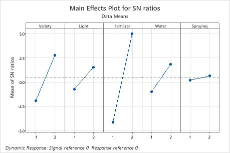
In these results, the main effects plot for S/N ratio indicates that Fertilizer has the largest effect on the signal-to-noise ratio. On average, experimental runs with Fertilizer 2 had much higher signal-to-noise ratios than experimental runs with Fertilizer 1. Spraying had a small effect or no effect on the signal-to-noise ratio.
Interaction plot

Taguchi designs traditionally focus on main effects, but it is important to test suspected interactions. Use the interaction plots to determine whether the effect of one factor on a response characteristic (S/N ratio, means, slopes, or standard deviations) depends on the level of another factor.

Interpretation

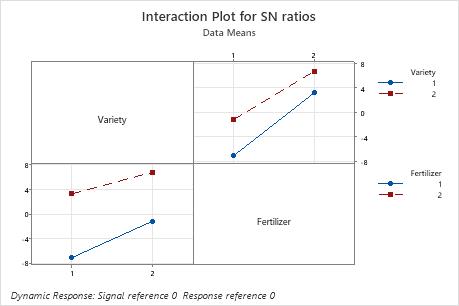
The interaction plots show interactions between factors. Minitab creates an interaction plot by plotting for two factors the characteristic average for each combination of factor levels. So, for two factors with two levels each, Minitab plots four points that represent the four possible combinations. The levels of one factor are indicated on the horizontal axis, whereas the levels of the other factor are indicated by different colored lines and symbols.
  • If the lines are parallel to each other, then there is no interaction between the two factors.
  • If the lines are not parallel to each other, then there is an interaction between the two factors.

In these results, for the S/N ratios, the lines are close to parallel. Variety 2 has a higher S/N ratio than Variety 1 using both Fertilizer 1 and 2.

In addition to the interaction plots, examine the linear model analysis to determine whether the interaction is significant.

Scatterplot

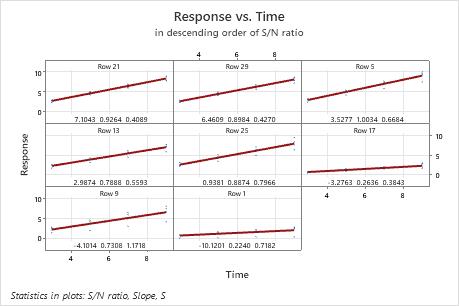
The scatterplots for dynamic response experiments show the responses plotted against the signal. Each plot shows all the data for one setting of the control factors in the experiment. The following items are shown on the plot:
  • The least squares regression line through the reference point.
  • The row number at the top of each plot, which refers to the first row in which the factor settings for that plot appear.
  • The signal-to-noise ratio, slope, and standard deviation for the factor settings, which are located at the bottom of the plot.

Interpretation

The graphs are arranged in decreasing order of the signal-to-noise ratio, so that the experimental runs with the highest ratios are plotted first. If the experiment has more than nine combinations of factor settings, Minitab displays more than one graph of scatterplots.

Consider the following questions:
  • Does the fitted line conform closely to the pattern of the data for the "best" experimental runs?
  • Is the pattern of the data a straight line or is it curved?
  • If it is a line, does it follow the fitted line, or is it shifted?
  • Are there any unusual response values or outliers?

In this plot, there is a substantial difference in the spread of the data between the best and worst fits. For example, in the plot in the first cell, for row 21, the data are very close to the line. In the plot in the lower left corner, for row 9, the data vary much more widely. The standard deviation for row 21 is 0.4089, but is much larger in row 9. The standard deviation in row 9 is 1.1718.