Use Dotplot to assess and compare sample data distributions. A dotplot divides sample values into small intervals and represents each value or small group of values with a dot along a number line. A dotplot works best when the sample size is less than approximately 50.
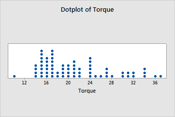
For example, a quality engineer creates a dotplot to examine the distribution of the amount of torque that is required to remove the caps from a sample of shampoo bottles.
Where to find this graph
To create a dotplot, choose .