Equivalence plot
An equivalence plot displays the equivalence limits, the confidence interval for equivalence, and the decision about whether you can claim equivalence.
Interpretation
Use the equivalence plot to view a graphical summary of the equivalence test results and to determine whether you can claim equivalence.
Compare the confidence interval with the equivalence limits. If the confidence interval is completely within the equivalence limits, you can claim that the mean of the test population is equivalent to the mean of the reference population. If part of the confidence interval is outside the equivalence limits, you cannot claim equivalence.
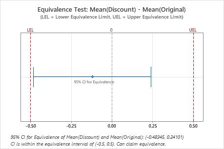
In these results, the 95% confidence interval is completely within the equivalence interval defined by the lower equivalence limit (LEL) and the upper equivalence limit (UEL). Therefore, you can conclude that the test mean is equivalent to the reference mean.
Histogram
A histogram divides sample values into many intervals and represents the frequency of data values in each interval with a bar.
Interpretation
Use histograms to assess the shape and spread of the data. Histograms are best when the sample size is greater than 20.
- Skewed data
-
Determine whether your data appear to be skewed.When data are skewed, the majority of the data is toward the high or low side of the graph. Often, skewness is easiest to identify with a boxplot or histogram.
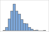
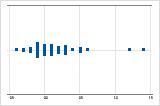
Right-skewed
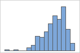
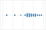
Left-skewed
For example, the right-skewed histogram shows salary data. Many employees are paid a relatively small amount, while increasingly few employees are paid large salaries. The left-skewed histogram shows failure rate data. A few items fail earlier while an increasing number of items fail later.
Data that are severely skewed can affect the validity of the test results if your sample is small (< 20 values). If your data are severely skewed and you have a small sample, consider increasing your sample size.
- Outliers
-
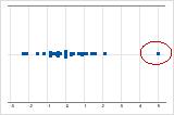
Outliers, which are data points that are far away from most of the other data, can strongly affect your results. Outliers are easiest to identify on a boxplot.
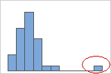
On a histogram, isolated bars at the ends suggest possible outliers.
You should try to identify the cause of any outliers. Correct any data entry or measurement errors. Consider removing data that are associated with special causes and repeating the analysis. For more information on special causes, go to Using control charts to detect common-cause variation and special-cause variation.
Individual value plot
An individual value plot displays the individual values for the sample in a horizontal column. Each circle represents one observation. An individual value plot is useful when you have relatively few observations and you want to assess the effect of each observation.
Interpretation
- Skewed data
-
Determine whether your data appear to be skewed.When data are skewed, the majority of the data is toward the high or low side of the graph. Often, skewness is easiest to identify with a boxplot or histogram.
Right-skewed
Left-skewed
For example, the right-skewed individual value plot shows salary data. Many employees are paid a relatively small amount, while increasingly few employees are paid large salaries. The left-skewed individual value plot shows failure rate data. A few items fail earlier while an increasing number of items fail later.
Data that are severely skewed can affect the validity of the test results if your sample is small (< 20 values). If your data are severely skewed and you have a small sample, consider increasing your sample size.
- Outliers
-
Outliers, which are data points that are far away from most of the other data, can strongly affect your results. Outliers are easiest to identify on a boxplot.
On an individual value plot, unusually low or high data values suggest possible outliers.
You should try to identify the cause of any outliers. Correct any data entry or measurement errors. Consider removing data that are associated with special causes and repeating the analysis. For more information on special causes, go to Using control charts to detect common-cause variation and special-cause variation.
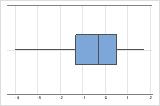
Boxplot
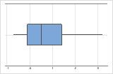
The boxplot provides a graphical summary of the distribution of each sample that shows its shape, central tendency, and variability. This allows for easy comparison of the groups.
Interpretation
Use a boxplot to examine the spread of the data and identify any potential outliers. Boxplots are best when the sample size is greater than 20.
- Skewed data
-
Determine whether your data appear to be skewed.When data are skewed, the majority of the data is toward the high or low side of the graph. Often, skewness is easiest to identify with a boxplot or histogram.
Right-skewed
Left-skewed
For example, the right-skewed boxplot shows salary data. Many employees are paid a relatively small amount, while increasingly few employees are paid large salaries. The left-skewed boxplot shows failure rate data. A few items fail earlier while an increasing number of items fail later.
Data that are severely skewed can affect the validity of the test results if your sample is small (< 20 values). If your data are severely skewed and you have a small sample, consider increasing your sample size.
- Outliers
-
Outliers, which are data points that are far away from most of the other data, can strongly affect your results. Outliers are easiest to identify on a boxplot.
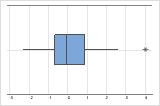
On a boxplot, outliers are identified by asterisks (*).
You should try to identify the cause of any outliers. Correct any data entry or measurement errors. Consider removing data that are associated with special causes and repeating the analysis. For more information on special causes, go to Using control charts to detect common-cause variation and special-cause variation.
- Equal variances (optional)
-
Compare the spread of the data
By default, the equivalence test does not assume that the variances for each group are equal. However, if you selected the Assume equal variances option for the test, compare the graphs for each group to ensure that the spread of the data is similar. If the spread differs substantially, you should not assume equal variances when you perform the test.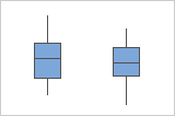
Note
To formally check for equal variances, use the test for 2 Variances.