Use Overlaid Contour Plot to visually identify an area where the predicted means of one or more response variables are in an acceptable range. Applications that involve multiple responses present a different challenge than single response studies. Optimal variable values for one response may be far from optimal for another response. Overlaid contour plots allow you to visually identify an area of compromise among the various responses.
Each overlaid contour plot consists of a pair of continuous variables (one for the x axis, one for the y axis). If there are more than two continuous variables, the additional variables are held at a fixed level. All categorical variables are held constant at one level. Thus, contour plots are valid only for fixed levels of the extra variables. If you change the holding levels, the contours also change, sometimes drastically.
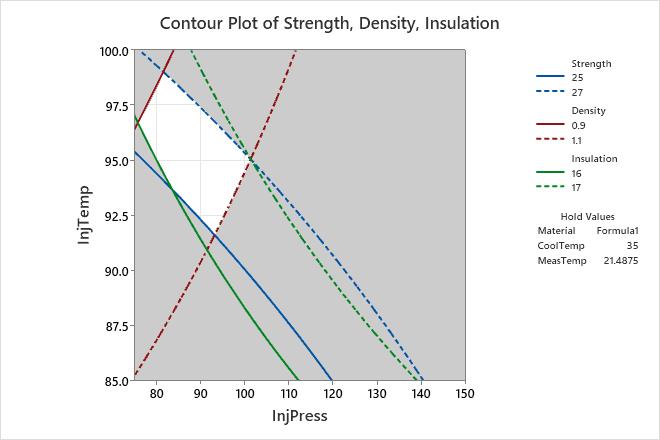
Look at the overlaid contour plot and find the white area, which is the feasible region. The feasible region is the area that is formed by the two continuous variables, given the holding values of any other variables, such that the fitted values for each response are between their respective contours.
Each set of contours defines the boundaries of acceptable values of the fitted response. The solid contour is the lower bound and the dotted contour is the upper bound. The contours of each response are displayed in a different color.
- Means for response variables that contain continuous measurements, such as length or weight.
- Means for response variables that contain counts that follow the Poisson distribution, such as the number of defects per sample.
- Probabilities for response variables that contain only two possible outcomes, such as pass/fail.
- Standard deviations for models that are fit using Analyze Variability.
For more information about how to interpret the results for a mixture design, go to Example of Overlaid Contour Plot with a mixture design.
Tip
To annotate the values of the predictors and the responses for any point on this plot, use Plant Flag. To plant a flag, right-click the plot, choose Plant Flag in the menu that appears, and then click the point on the plot that you want to annotate. Use Predict to determine whether these points are unusual and to assess the precision of the predictions.
Key Results: Overlaid Contour Plot
On this plot, Strength, Density, and Insulation are the response variables. Engineers want to find InjTemp and InjPress settings that produce values for all three response variables that fall within the boundaries of acceptable values.
InjTemp and InjPress are plotted on the y- and x-axes, respectively. Material is a categorical variable that is held at Formula1. CoolTemp and MeasTemp are continuous variables that are held at 35 and approximately 21.5, respectively.
The white area in the plot displays the combination of values for InjTemp and InjPress that yield satisfactory fitted values for all three response variables, given the holding values for the other three variables. Therefore, any variable settings for InjTemp and InjPress that fall in this region should produce a product with acceptable mean responses.
You can use overlaid contour plots in combination with the Response Optimizer to find the best setting for each variable.