About bars
Histograms, bar charts, and Pareto charts are examples of graphs that have bars by default.
Graphs that display bars by default
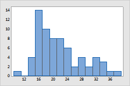
Histogram
By default, bars represent the number (frequency) of observations falling within each interval (bin) for a continuous variable.
Bar chart
Bars represent category tallies, different statistics of categories (for example: mean, sum), or summary values of categories.
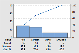
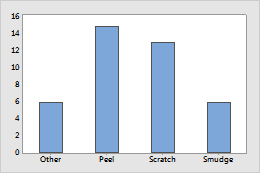
Pareto chart
Bars represent counts for types of defects.
Graphs that display bars as an option
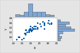
Marginal plot
Histograms in the margins represent the frequency of x- and y-values, so that you can visualize the distributions of x and y, in addition to their relationship.
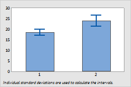
Interval plot
Bars represent the means of the categories.
Modify the colors of bars on a graph
Suppose your bar chart summarizes the following data:
| C1 | C2 | C3 | C4 |
|---|---|---|---|
| Operator | Machine | Data | Colors |
| 1 | 1 | 6 | 4 |
| 2 | 1 | 7 | 4 |
| 3 | 1 | 8 | 4 |
| 4 | 1 | 9 | 3 |
| 1 | 2 | 6 | 2 |
| 2 | 2 | 7 | 2 |
| 3 | 2 | 7 | 2 |
| 4 | 2 | 7 | 2 |
Change the color of all bars or an individual bar
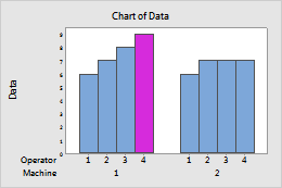
Suppose you want to create a bar chart of the data in the example worksheet and make a single bar a different color.
-
Create a bar chart of the data in the example worksheet:
- Choose .
- From the Bars represent, choose Values from a table.
- Under One column of values, choose Cluster. Click OK.
- Under Graph variables, enter Data. Under Categorical variables for grouping (1-4, outermost first), enter Machine and Operator.
- Click OK
- Double-click the graph.
- Select the bar or bars that you would like to change. Click a bar one time to select all bars. Click a second time to select an individual bar.
- Double-click a selected bar.
- On the Attributes tab, under Fill Pattern, choose Custom.
- From Background color, choose the color.
- Click OK.
Create a graph with each cluster of bars a different color
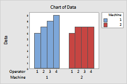
Suppose you want to create a bar chart of the data in the example worksheet with all the bars for Machine 1 one color and all the bars for Machine 2 a different color.
- Choose .
- From the Bars represent, choose Values from a table.
- Under One column of values, choose Cluster. Click OK.
- Under Graph variables, enter Data. Under Categorical variables for grouping (1-4, outermost first), enter Machine and Operator.
- Click Data View.
- In Categorical variables for attribute assignment, enter Machine.
- Click OK in each dialog box.
Use an attribute column to specify colors
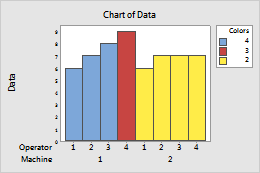
Suppose you want to use the Colors column to determine the color of each bar. Minitab assigns colors to the groups.
- Choose .
- From Bars represent, choose Values from a table.
- Under One column of values, choose Cluster. Click OK.
- In Graph variables, enter Data and in Categorical variables for grouping (1-4, outermost first), enter Machine Operator Colors.
- Click Data View
- In Categorical variables for attribute assignment, enter Colors.
- Click OK in each dialog box.
- Double-click the graph.
- Double-click the x-axis of the bar chart. On the Scale tab, under Space Between Scale Categories, deselect Gap within clusters and enter -1.
- Deselect Gap between clusters and enter 0.
- Click the Show tab. In Show Labels By Scale Level, deselect Tick Labels for Colors. Click OK in each dialog box.
Use an attribute column to specify the colors (with session commands)
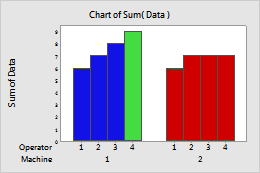
Suppose you want to use the Colors column in the example worksheet to determine the color of each bar. Minitab assigns colors to the groups.
- Click .
-
In the
Command Line pane, enter the following command
lines:
Chart Sum(Data)*Machine; Group Operator; Bar; Color Colors. - Click Run.
Change the base position of bars
The base position is a value from which the bars originate. Graphed values greater than the base position project up from the line; graphed values less than the base position project down from the line. You can change the base position, for example, to show distance from a target value.
- Double-click the graph.
- Double-click a bar.
- On the Box Options tab, under Base Position, click Custom and enter a y-scale value for the base position.
- Click OK.
Example of changing the base position of bars
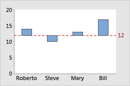
Suppose each person on your sales team has a goal of $12,000 for a month. The base position 0 makes it easy to compare total sales. To emphasize the relationships to the target value of $12,000 (12 on the y-scale), you set the base for the bars to 12 and draw a reference line there. Now, you can see that Steve's totals are below the goal, Mary's are slightly above, and Roberto and Bill's are the highest.
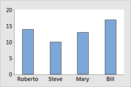
Base position = 0