Capability Histogram
The capability histogram shows the distribution of your sample data. Each bar on the histogram represents the frequency of data within an interval.
 The within and overall curves on the histogram are normal distribution curves that are generated using the process mean and different estimates of process variation. The dashed within curve uses the within-subgroup standard deviation. The solid overall curve uses the overall standard deviation.
 Interpretation
Use the capability histogram to view your sample data in relation to the distribution fit and the specification limits.
- Visually examine the distribution fit
-
Compare the solid overall curve to the bars of the histogram to assess whether your data are approximately normal. If the bars vary greatly from the curve, your data may not be normal and the capability estimates may not be reliable for your process. If your data appear to be nonnormal, use Individual Distribution Identification to determine whether you need to transform the data or fit a nonnormal distribution to perform capability analysis.
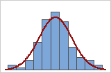
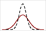
Good fit
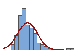
Poor fit
Note
You can use the Transform option in Normal Capability Analysis to transform nonnormal data. To fit a nonnormal distribution to your data, use Nonnormal Capability Analysis.
- Compare the within and overall curves
-
Compare the solid overall curve and the dashed within curve to see how closely they are aligned. A substantial difference between the curves may indicate that the process is not stable or that there is a significant amount of variation between the subgroups. Use a control chart to verify that your process is stable before you perform a capability analysis.
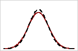
Closely aligned
Poorly aligned
Important
For a more thorough analysis of the assumptions for normal capability analysis, use Normal Capability Sixpack.
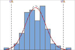
- Examine the sample data in relation to the specification limits
-
Visually examine the data in the histogram in relation to the lower and upper specification limits. Ideally, the spread of the data is narrower than the specification spread, and all the data are inside the specification limits. Data that are outside the specification limits represent nonconforming items. Evaluate whether the process is centered between the specification limits or at the target value, if you have one.
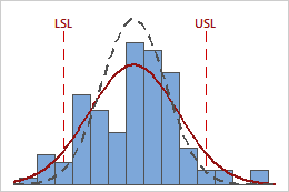
In these results, the process data appear fairly centered between the specification limits. However, the process spread is larger than the specification spread, which suggests poor capability. Although most of the data are within the specification limits, there are nonconforming parts below the lower specification limit (LSL) and above the upper specification limit (USL).
Note
To determine the actual number of nonconforming items in your process, use the results for PPM < LSL, PPM > USL, and PPM Total. For more information, go to All statistics and graphs.